Sunday, 22 January 2017

Industry Project- Promotion

I knew that I wanted plain, infinity-roll, background shots for our look-book so photographed these on a model too. I am confident that my front, back, side and detail shots would aid the press and buyers to better understand the collection.

I edited the shots from both the on location and look-book shoots and selected my favourite finals. I expected my peers to arrange them into a physical look-book but having delivered the files, received no indication that a look-book was underway. To ensure we met the assessment criteria I mocked up an electronic look-book and campaign.

I sent this to a peer to align, edit and finalise, which she declared was done properly, yet later discovered no alignment to have been done and very little by way of titivation to my original file. At this stage I felt further let down my promotion peers.

I enquired as to the concept behind our invitation to discover no invitation was in preparation. I was disappointed with the simple and basic invitation that was later produced knowing how creative contemporary fashion promoters are being in the industry with their fashion show invitations.

Come presentation day I felt a little drained and that this collaborative project had not been very collaborative. My tutor encouraged me however be proud of my own achievements on the project and this I felt was reflected by our second place award.


Industry Project- Fashion Shoot

With my garments ready and a shoot scheduled I was under the understanding we would be shooting in a old-fashioned house with clashing wallpapers and printed carpets- as this was the concept I had pitched and agreed upon with the promotion students of my group.

No menswear was created in time for our shoot, nor in fact at all, so we were not able to shoot the 'Gucci man' I was eager to include in the campaign.

A peer had discussed shooting the looks on film camera and I felt this would work very well- me having researched into the film-based photographer Nan Goldin for some of initial development.

I had also asked another promotion group member to source set for the shoot; bedsheets, lampshades, trinkets etc.

Upon arrival on location it emerged my peers had neither set nor film camera and that the rooms were neither wallpapered nor carpeted.

I felt at this stage, let down by my promotion peers who seemed to be delivering very little regarding the concept we discussed. In the absence of any decision making my them, I decided to take charge and the make the most of the day and resources we had available.

I styled an initial shot outside using the array of old chairs from a junk heap on site. I had brought my own DSLR and proceeded to photograph the entire editorial- something I am used to doing for own projects anyway. I was initially annoyed as this was supposed to be my peers' forte and a collaborative project, but in retrospect am quietly pleased that I was in more creative control over the photography of my own pieces.

I expressed however that the concept was to shoot in a higgledy-piggledy interior and that we had no interior shots. I was ready to leave when a peer at last stepped-up and noticed a piano in one of the rooms on our location. I proceeded to lift objects from around the South-east London Plumstead home and arrange them atop the piano to form a random, old-fashioned looking set for a second shot.
From this stage onwards the proceedings went smoother and a creative buzz arose. We left highly content with the shots.

I was very pleased with the accessory designer in my group who created amazing bags to incorporate in the campaign. I enjoyed mixing these items in with the random objects I was selecting.

Industry Project- Garments

Together with the textile designers of my group, we selected an oilcloth material for the Huysum inspired design to be printed on. I liked that the fabric would have a sensual/ sexy feel via its oily gloss and smooth texture but also felt certain, when worked in the right silhouette, it would be sellable as a s/s, showerproof, raincoat.

We also began looking at William Morris prints, which had the same dated and yet tasteful feel as some of our other reference material and I brought this into my design development also.

I was disappointed with the level of collaboration between myself and the menswear designer of my group, who presented very little to the table and worked at a painstakingly slow pace.

I was proud of my hasty work and my ability to manage the group and having produced three whole Womenswear looks felt I had made a succesful contribution thus far.

Industry Project- Briefing and Design Development

I elected 'Gucci' as my first choice, from a list of 9 labels, to work collaboratively towards elevating in new and considered direction. This was because I feel that many of the qualities 'Gucci' is synonymous with are being lost under the current, albeit innovative and exceptional, creative direction of Alessandro Michele. I knew I wanted to inject my own aesthetic into the brand whilst maintaining a sound and considerate understanding of Gucci past and present.

I threw myself right into the deep end and wanted a concept to develop on within the first hour of working. I was conscious to ensure group collaboration and to encourage a sharing of ideas. We all agreed that Gucci has always been a 'sexy 'luxury' brand and that a reintroduction of an aesthetic closer to that of Tom Ford's late 90's/ early 00's work, would benefit the brand. Very little passion and inspiration was voiced from my group peers, so I carefully assumed the role of leader within the group and pitched the following concept.

I wanted to create an eclectic 'Gucci' whose references are rich but whose silhouettes are more classic and 'feminine' in the more traditional sense of the word. 'Sex' was to be the primary driver for design whilst the 1970's 'good taste meets bad taste' look that dominates current collections should be carried through in some respects.

I looked to 1970's porn sets, where 'ugly' upholstery, seedy leather sofas and polyester curtains work within my current mood for the project. One image of a male porn-star in 'bad' denim trousers with a button- fastening all the way from the hem to the hip was particularly inspiring and became my first solid reference material.

I knew the print and textile designers in my team were working towards a floral print but was conscious of quite how much their initial work was grounded in a style very much the same as current Gucci. I felt the work would not move the brand forward and simply replicate what is already happening. I therefore encouraged my peers to look at Dutch and Flemish still life painting, namely that of Vermeer and Huysum, which I felt mirrored some of the upholstery I was looking at, yet would add a mature-feeling, luxury undertone to the more 'fun' and bad-taste references I was working on. I was extremely happy with all their work thenceforth thats maturity and elegance would ground my designs in a commercial and saleable realm.

I sketched with my peers' prints in mind and found a 00's silhouette was coming through naturally. I chose then to research further into the era. An haute-glam meets hip-hop character arose in my imagination- I felt the flesh-bearing, sex appeal of silhouettes inspired by this character would produce a well-needed break from the sexless, shapeless and casual garments that have been popular on the runway in recent seasons.

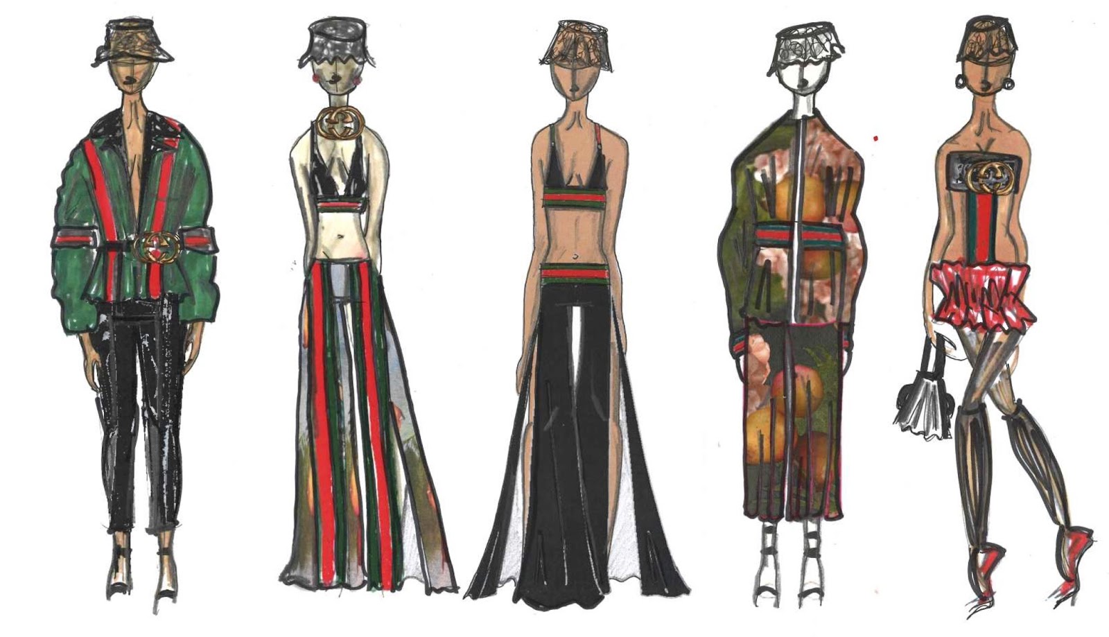
I could not avoid the over-branding of Gucci that happened in this era and how some of the merchandising associated with the label had become tacky or non-luxury seeming. I wanted therefore to take back ownership of the Gucci-stripe and give it a new lease of life, in very obvious way. I accented my initial collection ideas with the red and green stripe and believe it adds a fun, youthful touch, to some of the feminine looks I was working on.

For my final line up, I chose to focus on the low waisted hip-hop trouser of the 00's, the 70's pornstar trouser from my intial research as well as the Huysum/ Vermeer paintings which were informing the prints for the collection too.
Author's own


Three Words Project: Final Outcome

My final line up takes a feminine and light approach to my original inspiration. I have lifted specific tones and colour combination ideas from Bacon's work and have mixed this with the idea of his own studio palette. Thickly applied paint in many shades, as if worked over time, present the notion of history and narrative- that the piece has been stood, for Bacon to brush waste paint off on to, for years. Large, hand meets tentacle details are highly decorative and make for a surreal distortion of the human silhouette.  
Final Line Up- Author's own

When paired with simple, attentively-cut, tailored trousers, the overall look, although elaborate, feels wearable and glamourous whilst hand sewn bugle and seed beads add a touch of necessary luxury. 


Final Outcome- Author's own

Three Words Project: Design Development

Moving on from my initial ideas on octopus tentacles (derived from surreal imagery in my own dreams) I began to look at limbs and hands and how they might, in a dream like scenario morph into tentacles.

I am pleased with my experimentation with paint on my own hands and well this looks photographed then collaged.

I set myself the target to create more physical, textural samples and am happy with the 8 painted textile samples I have created both as colour studies in their own right and ideas for final product fabrications.

I have continued sketching in a prolific way and find sticking to the same colour palette a sure way to procure consistency throughout my project.

As my design process draws to a close I am refining my abundant research and design development material into a succinct collection that capitalises upon my original ideas of surrealist dream imagery (tentacles), Bacon texture and colour, and elaborate hand inspired decoration.

Design Development- Author's own


Sunday, 11 December 2016

Three Words Project

I believe this project gives much scope for extensive exploration. The combining of not necessarily connected words can provide interesting outcomes.

I have chosen to research and explore the great existential, abstract artist Francis Bacon. I love his use of colour (this was my primary reasoning for choosing his name from a list of iconic people such as Frank Zappa and Frank Lloyd Wright ).

Initially I felt the best way to research the artist was to gain a wider understanding of his work and the work of his contemporaries. This led me to research into Dali's self cannibalising creatures and the exploration of hell by the Chapman Brothers. I was prompted to note that it is ok to focus and specialise on one specific person, even more so one specific detail to do with that person. With this in mind, though happy to have developed my knowledge of surrealist and grotesque artists, I began to hone in on my favourite things about Bacon's art. I am pleased to conclude that my research is more focused because of this.

The primary concept of my explorations so far has been to take the dark, often morbid paintings of Bacon, that feature screaming and crucifixion, and translate the forms and figures within each work into patterns, florals and silhouettes much more light, feminine and 'beautiful' than the originals. I believe the outcomes so far are very succesful, most notably because of the strong and aesthetically harmonious colour palettes I have identified and curated from tones used by Bacon.

Sketchbook concept board author's own- using imagery from multiple sources


I have continued to explore the process of Frankenstein collages- I believe the ones I have produced for this project are the strongest yet because of their unique visual appeal and abstract quality.

I have explored fabric manipulation on the neck to make subtle reference to Bacon's personal struggle with chronic asthma. I wanted the result, much like the imagery on some of his portraits, to look like tumors/ disease/ infection.

I have been mindful of the lack of textile exploration on previous projects. For this final term sketchbook I am exploring painted textile and the creation of 3D, appliquéd florals to emanate the visuals of Bacon's work.

I do not wish to lift directly from Bacon's art, rather understand his style; his textured application of paint, existential musings and inner darkness. I aim to subvert this with ostensibly serene floral patterns, that on closer examination are formed from darker, original forms inspired by Bacon's art. Flashes of dark pink, red and black aim to hint at flesh, blood and death whilst surroundings of orange, green and lighter pinks will present indications of the opposite.

As regards to my second two words, the first being 'Francis Bacon' I am drawn towards 'Decorate' and 'Surreal'.

Surrealism is perhaps an obvious choice when exploring Bacon, though I feel strongly that my own angle on 'surrealism', namely the images that appear in my dreams like octopuses, teeth falling out and falling, can result in a unique outcome. I will use such images to create similar florals to those which I am designing with Bacon's painted silhouettes.

The research and outcomes so far are visually pleasing yet suspicious upon extensive inspection. The florals and silhouettes I am exploring are highly decorative. My final word then shall be 'decorate'.

Author's own


I believe my work so far is promising and I am excited to work on sampling, leading towards a hopefully succesful final garment.  

Wednesday, 7 December 2016

Saatchi Gallery and Tate Modern Visit 06/12/2016

'Deceive'

I have been greatly inspired by Richard Wilson's '20:50' Installation in the Saatchi Gallery. Wilson explores the art of deception masterfully. I could explore this notion in my own work too somehow perhaps via abstraction, distortion of silhouette or choice of materials, with which I could 'deceive' my audience in the very same way creating surprising and interactive clothing. I would work with reflection, sculpture and negative space to do this. The medium of sump oil could inform my colour choices or material choices also.

Richard Wilson's 20:50'
at the Saatchi Gallery, London

'Scratch'

I found the work of Raffi Kalendrian to be inspiring also. His colour combination and character exploration interests me. He works with 'real people' and creates a sense of 'story' within his oil paintings. His 'scratch work' (scratching layers of paint away to reveal the lower layer) could inspire the processes I choose to use within this project.

'Distort'

Ryan Mosley's oil paintings explored grotesque human figures in an interesting and endearing way. I liked the cultural feeling of the paintings as well as the profound sense of movement they conveyed. Print and pattern play a role in his art work and could inspire me in terms of the exploration of multiples and the distortion of the human body.

'Provoke'

To me, the work of Bjarne Melgaard was provocative and vibrant. His use of colour is impressive- I like his bold palette- whilst his exploration of slogans like 'cock' and written text could inform my own design work, where I too could use strategic words to provoke and captivate my audience/ client.

'Combine'

I loved the random quality of Richard Tuttle's 'System VI,  White Traffic' at the Tate Modern. His combination of wood, fireboard, terracotta, polystyrene and vinyl, among other mediums, was interesting and well-considered. I am inspired to combine, contrast and clash opposing and unrelated mediums within my final outcome.

'Peel'

Keith Sonnier's peeled layer of painted latex, manipulated with pigment and sawdust, on show at the Tate, inspires me to paint and peel in my own explorations. Using a liquid to then form a solid layer interests me and could result in the creation of an entirely new textile.

Sonnier's 'Red Flocked Wall'

Historical Details Project Fashion Shoot

I feel that my final shoot for this two-week project has been a success. I love the contrast of the bright
red against the cold stone back drop of the Queen's House and Royal Naval College in Greenwich. 

I would have liked to have shot inside the Queen's House but unfortunately was prevented by a typical jobsworth. The Queen's House holds many of the portraits I researched and referenced throughout the project so it would have been effective to photograph the final outcome against the original inspiration.

I am nevertheless very proud of the below shots.

Photographs Author's Own
Model: Olivia Morgan


Sunday, 4 December 2016

Historical Details Week Two

I wanted to choose a textured detail from my historical era to dissect and elevate into contemporary fashion. Using the skills learnt with Sarah in our design workshop, and developed during the two following projects, I started to sketch modern outfits inspired by details explored during my research. I picked three main details; a jacket fastening, a glove adornment and appliquéd stripes.

From the moment I saw the 17th century shoe (picture on previous blogpost) I was fascinated with the detailing and was determined to refer back to it later in the week. This striped detail soon became the key focus for my project. I love its linear effect and colour and am pleased that my designs inspired by it sufficiently elevate the detail.

My final line up works the detail as a top, skirt, jacket, coat and trousers. The mini-collection includes a fringing detail drawn from a woman's glove and bows inspired by a stomacher of the era.

Although the construction of a garment is not required for this project I felt too inspired to not create a piece and realise my ideas in 3D. I have worked on a jacket that references several design details from my research process. This includes tight pleating, an 'elevated-Puritan' collar (taking the typical Puritan style which dates directly before my chosen era and re-working it with an English restoration-style outlook), shoulder features and floral work as well as the focal appliquéd stripes.

I believe the final garment succesfully combines all my secondary and primary research. I could not have completed this project without my informative and deeply inspiring gallery, library, museum visits which gave me additional literary/visual inspiration beyond that easily available to and routinely used by other students.


Final Line Up

Sunday, 27 November 2016

Historical Details Week One

I am very passionate about history, fine art and literature therefore the new brief of dissecting a chosen historical era and analysing the design details, textiles and pattern from arising inspiration is perfect for me.

As soon as the brief was mentioned the highway man came to mind. I believe this is because I have been watching and enjoying Canal Plus' 'Versailles', the ten episode period drama following Louis XIV. 

Revolving my time bracket around famous highway man 'Claude Duval' I engaged in further extensive research. I found the famous french villain operated in England as opposed to his home country. 

I am pleased then with my decision to study England during the late 17th Century rather than the famous and more commonly explored contemporaries across the channel. The era is called 'The English Restoration' and begins with King Charles II returning to his 'rightful' position as king after the austere, Puritan leadership of Oliver Cromwell and his son Richard Cromwell, the latter under whom a demise of leadership began. I love the decadence and opulence of the era. The court of the nation takes a sigh of relief after being released from the strict rules of Cromwell's leadership and head full throttle towards debauched and dandy lifestyles of drinking, sex and vanity. I have always been a lover of colour and this era rich colours return to fashion tenfold. I am an actor and vocalist with a love of the theatre and in this era Charles II, an admirer of performance, lifts all bans on players in the country setting up two court ensembles for his entertainment. The fascination with gods and goddesses at the time, demonstrated in portraiture, namely that of Peter Lely who would depict the 'celebrities' of the time, such as Catherine of Braganza, Nell Gwynn or Barbara Villiers in the roles such as Minerva, Venus or St Catherine, represents the courts obsession with power and beauty; immortality even. 

Even for the lower classes, who of course did not share in the excess of the uppers, a newfound sense of independence emerged, where many had at least some disposable income for the first time in their family history. This was owed to new markets such as makeup flogging and portrait etching distribution. With a freer market and a return to the previously prohibited pastimes such as cockfighting and gambling even the poor could share some way in the return to royalist debauchery.  

My visits to The Wallace Collection, The National Gallery, The National Portrait Gallery, The National Art Library and The Victoria and Albert Museum have succesfully broadened my knowledge of the era. I love to read into the historical details hearing how they would perfume their gloves with jasmine flower and frangipani or cake their faces with lead based products to cover their skin imperfections. I love to use the images in my presentation; one of my sketchbook pages includes jasmine flower imagery from contemporary paintings as well as modern photography. 

Having discovered on previous projects how effective 'Frankenstein collages' are for developing unusual and creative silhouettes in a prolific and interesting manner, I chose to continue my usage of the design development method with this project. 

Rough and playful sketching enable me to enter into the mood of the era. Fun scribbles evoke the frivolity and style of the times.

I have learnt to be much freer with my sketching style using techniques like cross hatching to explore tone and shade. I believe my work looks much more professional because of it my previous sketches looking tight and immature in comparison. 

Moving forward I wish to elevate the design details I have chosen into a modern aesthetic suitable for a 21st century wearer. I may use simpler, modern silhouettes combined with specific details to achieve this. I wish to develop a key colour palette to stick to throughout the process and will endeavour to source suitable materials in the next few days. 

Sketchbook work Author's own
 using imagery from 'Historical Fashion in Detail'


Sunday, 20 November 2016

Deconstruction x Reconstruction Week Two: 15-20.11.2016

My research into the 1930's and construction workers has led me to explore the workman's coat, a garment that has consistently appeared in the imagery I have referenced.

Using paper scans and print outs of various deconstructed garments from my primary research is an effective way to develop silhouettes and possible designs. Working in my colour palette on sheets of paper, without wasting material, is effective and prolific and my outcomes feel relevant and experimental.

I concluded after previous self-evaluation that I needed to explore texture and textile more extensively.  Using my deconstructed material I have developed several samples that I feel are succesful. Namely a knotted/woven/platted pieces from torn and shredded upholstery velvet curtains. The sample has a rough feel that effectively works for my 1930's working-man aesthetic. The material has denim effect which I consider effective considering the 'Of Mice and Men' imagery in my research, which features various denim fabrications.

I have translated the yellow straps explored from the attire of Brazilian female construction workers into strap details on coats. The straps look like those on dungarees- a garment typical for workers in the 1930's.

Towards the conclusive phase of my research and design development I chose to look at other examples of females in a construction-work/ labour environment. Some images of women in munitions factories during the war paralleled my research into the modern day Brazilian woman's attire. Blue shirts and yellow emerged as strong colours for reference in both images and create an interesting narrative between then and now.

The aprons of female charcoal kiln feeders from 1939 inspire me too and have been translated into peplums and trouser silhouettes on certain designs.

When finalising my designs I chose what I felt were the strongest details from throughout my explorations and developments; this was the denim fabrications from 'Of Mice and Men' research, the workman's coat and casual tailoring from explorations of 1930's 'real characters' photography and the draped sleeve/ shoulder details developed from a deconstructed knife pleat skirt, inspired by the Chrysler building in New York.

I am happy with my final developments of coat designs. I love using 3D textile within my sketches and feel I could have explored this method of design more extensively.

I am confident that my concept threads consistently and concisely through my sketchbook and that my final outcome is a successful emanation of definite, conceptual research.

My final coat uses deconstructed curtains, jeans, trousers and tailoring and feels highly relevant to my 1930's workman aesthetic.

Concept board- Author's own


Tuesday, 15 November 2016

Deconstruction x Reconstruction Week One: 11-14.11.2016

I chose to research what buildings were constructed around the 1930's. The Chrysler building in New York felt relevant. Its glamourous silver structure well contrasts the browns and rust of the workers that made it. I love vintage photography of the constructers that worked on the building, and others like it. I intend to develop from the images I have found. 

I am very pleased with my use of a deconstructed pleated skirt during a stand session this week. Looking at 1930's Cristobal Balenciaga couture, as well as the structure of the Chrysler building, I draped a neck piece and sketched a sleeve, the result of which, I feel, makes an interesting catalyst for design development. The draping references also, Steinbeck's Curley's wife and her dreams of Hollywood glamour.


Deconstructed denim feels hyper relevant to my concept and I intend to work with it further. My sketch work and collage of denim jeans forms initial ideas on colour and form that I deem exciting and therefore succesful.  

Conscious to keep my project relevant and modern, I have researched into modern construction work, so as contrast the imagery of Dust bowl America I have collated. I have found that Brazil is leading the way globally in regards to woman in construction, procuring the breakdown of gender stereotypes and restricting barriers. The country employs over 5,000 female workers; their blue and yellow attire is inspiring to me. 

With modern construction in mind I have chosen to pick an iconic brand, synonymous with construction, to elevate into high-fashion. 'CAT', famous namely for their sand coloured builder's boots, feels relevant. I intend to incorporate their logo into my work. 

My research into 1930's workers and 'Of Mice and Men' demonstrates that many the poor, working man, would wear casual, brown coloured tailoring as well as the denim dungarees that might more immediately to mind. My decision to further deconstruct a casual blazer, inspired by this research was succesful as it effectively reimagined silhouettes and form. 

I am pleased with my print design exploration of scaffolding and photography commissioned by the 'MTM Construction Group'. The resulting image feels extra successful as it relates, to me, to the 'strong and rocky Gabilan mountains' described in Steinbeck's 'Of Mice and Men'. A combination of this print with my elevation of the 'CAT' brand, deconstructed tailoring/ denim, and the introduction of a flattened yellow hard hat (combining the 21st century builder's attire with the 1930's labourer's flat cap) feels succesful and innovatory. 

Accumulating my research, leads me to identify five key outcomes from my initial research;

- 1930's Old Hollywood Evening Wear (fluid draping)/ Curley's Wife's Dream
- Rough denim (1930's Workman/ characters in 'Of Mice and Men)
- Casual Tailoring (1930's Workman)
- Elevation of the 'CAT' brand
- Brazilian female construction workers


With the 1930's workman a key part of my exploration, I looked back at all my image research. The overriding image seems to be the workman's casual coat/ tailoring. I wish to combine this base with colour inspiration from modern female construction workers and draping inspired by Old Hollywood glamour. Design details can reference too characters from Steinbeck's novella such as 'red mules' or a 'Stetson hat'. 

Working on the stand and body with paper is a highly effective method for research as well as design development. I have explored silhouette and cut via this method and believe my outcomes challenge normal styles and result in an innovative, unique look. I love the quick and prolific nature of the design method. 

Deconstruction x Reconstruction Week One: 8-10.11.2016

'Deconstruction' is the taking apart of something once 'constructed' or put together. 'Reconstruction' literally means putting something back together. In relation to this project however 'reconstruction' entails reworking and reimagining an original, perhaps banal, item of clothing and elevating it into something creative and new. I love the project brief. Working with fabric and existing garments is something I feel very confident with. This is owed to the fact, as a child, and throughout my life, the materials available to me, to realise my creative thoughts, were often existing products, hand me downs and clothing waste. I feel at home turning an old rain coat into a dress, my brother's rugby shirt into a jacket or even a dog blanket into a evening gown. 

Towards the end of the 'Structure and Attachment' project, I felt my collage work was among the strongest of the development styles utilised. I am happy with my decision to work with the method again and believe the 'Frankenstein collages' I have created are an effective catalyst for the new project. The collages succesfully challenge my typical, go-to silhouettes and encourage a far more creative vision in regards to working clothes and shapes in flat. 

Having felt restricted by the 'monotone' criteria of the last brief, and having been encouraged to explore colour more thoroughly in my assessment, I am focusing on developing a colour scheme throughout this mini-project. 

One particular collage has become the catalyst for my concept with this brief. When arranging my exaggerated forms in a uniformed line I immediately thought of lines of workers; lines of 'construction workers'. I like the idea of looking at the word 'construction' in regards to 'construction workers' and not just the construction of a garment. I put aside the concept briefly, in order to fully concentrate on my primary research of existing garments, but hastily returned to it for further development.


Sketchbook work and collage Author's own with muse from GQ magazine

I feel that looking at existing garments is an extremely effective initial process for design. I am pleased with my pencil and pen sketches of folds, buttons, towelling, ruffling and more, and believe my mark marking skills are becoming more succesful, the freer and more fluid I do them. 

Working garments on the stand is a resultant process. It has allowed me to re-imagine classic cuts and shapes and interact with the body in a more prolific manner. 

Working at high speed leaves little time for fussy and unnecessary perfection, resulting in raw, originative outcomes. 

Unconventional combinations of fabrics, during the primary research stage, may inform later outcomes. My work with camouflage and pink towelling felt particularly succesfully as well as inventively witty. 

The silhouettes I have been creating during research have resonated with me in regards to 1930's style imagery. Crossover night gowns, elegant draping and tea dresses have all sprung to mind and later, when working with denim and rough linen, the masculine 1940's worker accompanied this 'old Hollywood' aesthetic and encouraged me to research further into the era, in order to develop a concept within the 'Deconstruction' brief. 

When working with a wacky, lurid green, velvet scarf, 'lettuce' came to mind. Instantaneously, this lettuce connected in my head the dream of "livin' off the fatta the lan" that the character Lennie holds in the 1930's novella 'Of Mice and Men' by John Steinbeck. 

I felt then that, what with previous explorations of lines of construction workers, rough denim and linen, as well as the Golden Age Hollywood, that 1930's Dustbowl America via Steinbeck's 'Of Mice and Men', would be a succesful concept for further research and development. 

I am pleased with my extensive research into the famous novella, turned play, turned movie and certain quotes have provided vivid inspiration for design.  

The character Curley's wife's dream of being a glamourous actress is contrasted by the dirt and denim of a Salinas ranch and the overall image is brimming with design potential. My research into Steinbeck's writing has resulted in finding inspiring quotations like 'coulda been in the movies and had nice clothes', 'I like beens with ketchup' and 'she wore a cotton house dress and red mules, on the insteps of which were little bouquets of red ostrich feathers'. I felt my further use of the frankenstein collage technique to develop this research was effective because it combines my primary research of the deconstructed garments, with my self-instigated concept. 


Tuesday, 1 November 2016

Final Photo Shoot

     models- Constance Knights + Maximilian Raynor


I am greatly pleased with my final shoot. I am confident that my decision to contrast the luxury looking 'upper class' pinstripe material with the location of derelict council flats is effective. The 'unisex' nature of the pieces has arisen naturally- I don't feel it too necessary to focus on this, with gender fluidity in fashion quickly becoming a norm. The fact both a woman and man can wear my final look also works with the theme of structure because it explores equality in that neither gender/sex is being more sexualised or domesticated than the other through their clothing; neither looks more or less empowered than the other. 

Wednesday, 26 October 2016

FINAL WEEK 26-28.01.2016 Structural Attachment

In the last stages of this project I focused heavily on texture, using fabric and knit samples collaged with sketches to explore potential final outcomes. I love using yet again another method of design development and will use the style of design on future projects.

I have not strayed from my wish to use quilted pinstripe material in my final design. I trialled numerous variations of the style and looked at scale and silhouette. I cannot source any yellow pinstripe material and prefer the grey tones anyway. I am confident that my decision to use both grey and yellow is justified, albeit contrary to the brief.  I am happy though that 'monotone' was part of original criteria as I have ended up with a more focused, professional looking project because of it (hopefully the reasoning for having set it).

I explored appliquéing felt ladders onto the final jacket but intend instead to use my laser cut accessory because  I believe it will have the same effect without becoming a permanent feature. It also means that my actual garments are monotone, with the second colour remaining to only come with accessories.

Having settled on a simple round neckline for my jacket, leaving the quilting as the main feature of the piece, all that remained was the development of my cuff/ glove accessories. I knew I wanted a subtle allusion to one of my original stimuli, the yellow rubber glove. My research into the structures of gender and the domestication of women/ their inferior position on the societal structure created by patriarchy, led me to develop yellow rubber glove throughout this project. In avoidance of a costume-like style, I neglected the use of actual rubber for my final piece in favour of more luxurious and wearable knitwear whilst also utilising knitting techniques I learnt earlier this month. The yellow cuff serves to contrast the heavily masculine pinstripe jacket. When finalising the design I decided that the combination of female and male could also be explored in the physical size of each glove/cuff- one being larger with the other feeling slimmer and more feminine. I decided that the gloves should feature 'ladder' imagery as reference to the social ladder- this will be in the form of actual knitted ladders as well as the addition of decorative cotton yarn to form the rungs of the ladder.

The decision to use both the laser-cut ladder accessory and the exaggerated length of the cuffs informed my decision to keep my trousers very simple. These will be cut in masculine wool material and have little specific detail besides the fact they shall be flared. The decision to flare the trousers has no theme-based reasoning behind it but has been made to be on-trend with the popularity of the style in current fashions.

Construction 
I have been constructing my designs in 3D since the age of seven therefore this process was not too difficult. I rarely use patterns and cut my final pieces from eye. I decided to use 6oz wadding for the quilting and satin-weave viscose for the lining. Having completed the construction of the jacket I hand sewed self-made binding on every raw edge and interior seam. I love the interior of the garment and am pleased with my decision to use binding as a finishing technique.

Knitting the cuffs was a lengthier process considering the first time I ever knitted was about three weeks ago. I am happy with the improvement I underwent when developing this new skill. I believe I have succesfully mastered the techniques of plain knitting, hemming, adding ladders and casting off.

Evaluation of construction 
In conclusion I feel I should have knitted my cuffs slightly wider for comfort and lined my trousers for extra quality and appeal. I would not use the satin viscose again because I found the satin lining snagged on occasion- I might use a plain weave on future projects instead. I am undecided how I feel about my decision to use 6oz wadding for the quilting. If I had used cotton wool (as an alternative for goose down) the rolls would have been more exaggerated (as I originally sketched) however I do like the beautiful wearability and relative stiffness of the wadding. Were I to develop an entire collection, I would use both styles.

Sketchbook author's own

Monday, 24 October 2016

WEEK EIGHT 24-25.10.2016 Structural Attachment

The key concept of my final idea surrounds the contrast of archetypal masculine material with subtle reference to the domestication of the female as part of an overall exploration of gender and class structure. This requires however the use of both grey and yellow. I have made the decision to work with both the colours, with my main garments remaining monotone but my accessories incorporating the second colour.

I am greatly pleased with the pages I created with this in mind. I feel there are three definite stages to my portfolio where I take a step up each time. The look seems professional, cleaner and more concisely focused on specific developments. Deciding on the two colours helps the general look to feel more focused and I believe the combination works really well. I am pleased with my use of part printed part hand-done pages and will develop this method as I enter the final stage of design for this project.

My exploration of numerous variations of the quilted jacket confirms in my head that I want to use the technique for my final design.

At this stage I feel ready to start looking at existing fashion and photography to support my work, having previously avoided any active research into designers for fear of subliminal copying.

Peter Lindbergh's exploration of androgyny in his photography fits well with the aesthetic I have created. The idea of the contrast between the feminine form and masculine suiting is explored and works as part of a over arching theme looking at gender normalities and established structured mentalities regarding sex and gender.

A particular shot by Alessio Bolzoni's sees a model of ambiguous gender in pin striped suiting. Again this look works towards my overall design idea.

It would be remiss not to acknowledge also the highly prominent trend for quilting this season; I hasten to add however that I had decided to develop the technique before the release of the a/w 17 collections which saw quilting from Demna Gvasalia for Balenciaga and Vetements, Marques Almeida, Stella McCartney, Raf Simons and many more.

I do not feel directly influenced by existing practitioners work but am keen to continually analyse and explore current contemporary designers and artists and well as legends of art and design.

As I begin to wrap up my project I am looking at refining my final outcome. I am pleased with my decision to elevate certain looks away from a more costume-like aesthetic towards one with a high-end, luxurious appeal. This decision included avoiding the use of actual rubber for my exploration of the domestic rubber glove and instead using high quality mohair and cotton yarns to create a glove like cuff piece. The result is also more commercial without, I hope, compromising on creativity.


Cuff/glove development Sketchbook page author's own
Using imagery from 'Youtube' and Attitude magazine. 


WEEK SEVEN Structural Attachment Sketchbook 20-23.10.2016

Feeling that my research and initial design process was coming to a head I decided to note down the arising design ideas in a specific list.

Divided into two sections, the list was as follows

Gender Structure- Man above Woman                               The Class Structure- Upper, Middle, Lower

yellow rubber                                                                       quilting (rolling in it)
pinstripe tailoring                                                                 tailoring 
neck ties                                                                               bow ties
double breasted suits                                                            hoodies 
J-cloths                                                                                 dungarees 
embroidered D's                                                                   grabbed cash silhouette
gender symbols                                                                    fragile draping 
'apron' ruffling                                                                      triangle imagery
ladder climbing

I can safely conclude that barely one of these design ideas would have arisen without my research process. This proves my initial developments to have been succesful and stands me in good stead to develop a final piece as my project enters its final stages.

Looking back at all previous sketches and research I sketched five developed tops, eight jackets, ten pairs of trousers and eight coats all including relevant fabric samples. I felt very at home with this process as it feels most natural to me. I feel the designs created are succesful, if a little costume-like in style, and am most drawn the mixture of quilting and pinstripe tailoring.

I love the idea of taking the masculine material and developing it in a less common style, like with quilting or by adding vinyl as reference to the yellow rubber glove.

When sourcing material, I am now obliged to commit to one colour. Yellow has been a continual motif throughout the project and will definitely feature in my final design- this has derived almost solely from my exploration and development of the image of the domesticated woman and rubber washing up glove. A conflict however arises as I am determined to use grey pinstripe suiting in order to subvert the masculine archetype.

I love colour combination; I feel it is a crucial aspect of design- there is real art in getting it right. The combination of the varying shades of yellow with granite, aluminium and charcoal looks expensive and works so well for my design idea and response to the word 'Structure'. I will hold back on making any decision on my mono-tone as of yet but will proceed to use only grey and yellow from now on.

Sketchbook author's own

WEEK SEVEN Structural Attachment Sketchbook 17-19.10.2016

With quilting quickly becoming a fundamental focus of my project, I decided to produce some collaged sketches to play with scale as well as different types of quilting. The pages successfully develop the possible design technique. I was pleased with one particular collage as it demonstrated how several scales of quilting can be used in the same design- a giant shoulder contrasted with smaller checked quilting for example. My work on creating quilting samples gives an idea of how the technique will work in 3D.

My exploration of quilting is part of my 'rolling in it' idea that looks at the idea of the wealthy elite living with excess cash ('rolling' in money). I decided then to explore the other end of the scale using the same method of a slogan style title. For those lower on the social and gender structure i chose the literal slogan 'ladder climbing'. This looks at those 'lower' down as struggling social climbers attempting to tackle the daunting cliff like structure created by white patriarchy.

I loved the idea of introducing design details synonymous with the working classes as well as with women. These included the hoody, dungarees and 'feminine' details like the apron as previously in the sketchbook. The contrast between rich symbols (the 'rolling in it' quilting and masculine suiting material) and 'inferior' symbols like the hoody is effective and is a key concept for my project; one to be further developed.

Developing from last week, where I found that collage style design was leading me to discover more innovative silhouettes and styles I created a series of pages. I am pleased with the outcome as I believe the method has brought out more unique silhouettes than had I simply sat down to sketch with just fine-liner. My introduction of ladder imagery, in laser cut felt or machine embroidery, is part of my exploration of the 'social ladder' as a stimulus for design. I like the shapes created and will develop the idea of the ladder later in this project.

Sketchbook page Author's own
including imagery from 'The Economist'