Tuesday, 9 May 2017

Final Major Project Week Five

I have previously received criticism that I do not always best show my final stages of design development. I agreed that often, after extensive research and development, I feel full of ideas and conclude on a final look without documenting that key, final process. For that reason I am conscious to devote lots of time to the design development phase in its entirety.

Through planning and production analysis I can conclude I am well on track/ ahead of schedule and this means I can confidently maintain a steady approach to the project, without rushing.

At the start of this week I explored latex textiles. Using trays, I solidified liquid latex to create sticky, skin like samples perfect for referencing my 'peeling' leather research. During the process I exploring adding in knit-de-knit yarn from deconstructed knitwear given to me on work experience at John Smedley. The end result reminded me of some research imagery of the detailed stomach linings of cows. Other samples included regular wool (acrylic) yarn shaped to mirror internal carcass structures. I spent a whole day exploring these samples on the stand, combining them with a large piece of coated scuba material left over from a previous project. I felt the results were very beautiful and elegant but by no means exceptional in terms of silhouette of general uniqueness of aesthetic.

Sketchbook page- Author's own

I am aware that my focus on colour and texture is strong and because of this I am deliberately avoiding both for the meantime. By eliminating the two, there is no distraction from silhouette and potential cut, resulting in all my efforts and attention being on shape and form. Using regular calico or tubular knit I have experimented and further developed shapes. I feel I am capable of a more intricate and detailed approach in terms of silhouette. The process of draping on the stand is interesting and prolific in presenting numerous ideas for final silhouette. I have pinched and tucked to mimic artist research images by Lovis Corinth and Chaim Soutine, stuffed and quilted to reference internal carcass structures and machine embroidered abstract cow prints, then padded them with foam and cotton wool to add 3D appeal/ translate docu-film research.

Design development page- Author's own

I am enjoying exploring different processes and feel I am constantly pushing myself forward and outside of my normal methods of practice. I feel some stand work has been more succesful than others; many pieces can appear deeply un flattering and too 'conceptual' resulting in a breach of my desire to flatter and emphasise the female silhouette.

Planning ahead I shall commence sketching ideas in black fine-liner and begin to draw the project to a conclusion. I will be certain to refer back to my sketchbook when doing this so that interesting and informative research/ development is not lost.

Wednesday, 26 April 2017

Final Major Project Week Four

I am wary of the time scale of my final major project and am therefore constantly checking my original project action plan and timetable. Having compared my proposed level of development with my current position I am confident that I am on top of work and planning my production effectively.

By week the end of week three I had intended to have extensive primary and secondary research, drawings and collages as well as to have conversed with peers about the subject matter in hand. I have achieved these aims so far and am even ahead of schedule, in that I am already well into the textile and silhouette development stage I had proposed to commence in week four. 

Upon reflection I have identified that at the beginning of the project I was more heavily involved with facts and figures and that I had hoped to combine slogans with my creative work. I have decided that, although this neglect was not necessarily intentional, it may well be for the best, as my work is edging towards a more conceptual, less literal approach to veganism. Through critical evaluation I have concluded to allow my natural progression away from original intentions, as this is part of the process. I may later return to the slogans, facts and figures I explored earlier in the project, for additional design or promotion purposes. 

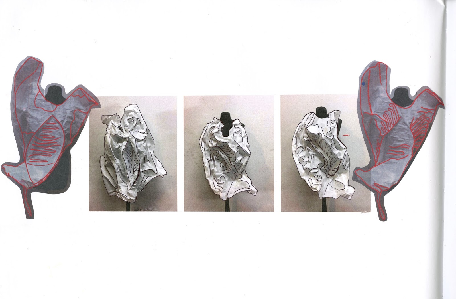
In order to advance my project I have begun official design development. I am using practical skills such as paper manipulation, calico stand-work and silhouette extraction to do this. I find the method of using paper on the mannequin effective in producing quick and easy silhouette ideas. I have so far translated artist research into Lovis Corinth into carcass inspired paper forms, extracted silhouettes from docu-film imagery of peeling/skinning cows- exploring them in thin-weight paper on the stand- and directly interpreted Alex Van Gelder's meat portraiture (as well as the primary research I conducted inspired by it) when draping in calico.

Sketchbook page- Author's Own


When presenting this development in my sketchbook, I felt some pages were more succesful than others. I identified the problem of fitting multiple variations on one page, along with the research that inspired it. I solved this by allowing a 'busier' page than I might usually and accepting that this need not compromise the success of the composition of the page.  I concluded also that going forward I would present my mannequin work on larger print outs to allow an audience better viewing of detailing.

Sketchbook page- Author's own


During the process of draping on the stand I endeavoured to find the balance between my context being apparent and an avoidance of too literal design-work. I pinned carcass shapes on the form, but allowed them to curve, fall and be manipulated. This made for an abstraction of the original silhouette whereby the reference and context becomes less obviously presented. 

I feel my stand work is very strong, however I am aware of the multitude of different styles I am trying to do all at once. This is something I habitually do and through self-evaluation am trying to address. Going forward I aim to tie each element of my research together seamlessly, but will certainly not cram all my ideas into one final output as this would dilute the content and decrease the overall quality of my project.

Sketchbook page- Author's own


Friday, 21 April 2017

Final Major Project Week Three

Having evaluated my work so far I am encouraged to be further conscious of exploring and utilising the multiple processes I have learnt throughout this foundation.

As part of my constant self-evaluation process I have asked peers their reactions to my work and also find group crit meetings highly useful. I have taken their advice to create larger textile and tactile samples. I have done this by delving into trials of melting, gluing, painting, stitching, dying and other surface decorations and fabric manipulations.
Process documentation collage- Author's own
The textile samples I am creating aim to be fleshy, skin-like and grotesque but to also have a touch of beauty and intrigue. Each sample is a literal or conceptual translation of my research material. For example for one sample I took a docu-film research image of a dairy cows in poor conditions and manipulated the image using the flatbed scanner. I found this to be a succesful method in producing interesting textile ideas on paper. The process is prolific and when combined with melted, synthetic felt in a blood red tone, stitched and cut into, revealing negative space, makes for a highly inspiring textile design idea.

As well as taking advice to trial larger samples I was also encouraged to have more primary research. I jumped out of my comfort zone therefore and began photographing meat in plastic. I referenced my artist research into Alex Van Gelder when conducting this photography session. I was inspired by him in that I used a black background and vivid/ intense colour contrast. I have since explored multiple processes with the photographs taken; I have printed on photo paper, tracing paper, brown paper and acetate and have also melted, stitched, sealed and cut into the images. Some of the primary research shots will be useful for silhouette extraction.

Sketchbook page- Author's own

I am believe my use of stitching and layering, to mirror cow prints discovered via my initial research stages, has been succesful. I have sourced interesting velvet and neoprene samples that when combined create an engaging juxtaposition.


Sketchbook page- Author's own

I am pleased that I was encouraged to hold-off beginning my official 'design process' of black line sketching/ clothing design on A4, as this has prolonged my earliest stage; which is the rawest creatively. This has meant I am continually developing varied processes and design methods beyond the, sometimes restricting, process of fashion sketching.

Going forward I feel I am ready to begin the more solid translation of initial research into design development. I will work on the stand in paper, calico and colour, collage images as part of silhouette progression and commence contextualising this development on the female form. 

Monday, 27 March 2017

Final Major Project Week Two

Through self-evaluation I identified the need to explore textile more extensively through my work. With this is mind I have explored the process of knitting as part of my initial design research. By weaving various materials into the needles of my machine I can create interesting, textural samples. I have chosen red and pink yarns to evoke flesh-like imagery, whilst an introduction of turquoise references my research into abattoir-wear. During this process I found that thicker woven strips could hinder the overall knitted sample, and that 5cm was approximately the maximum width for external yarn additions when knitting.

Knitting process- Image Author's own
 As part of my constant self-evaluation process (which I believe will help me procure a better outcome in the long run) I have discussed my work with peers, asking their advice. Many have declared how shocking some of my research and sketchbook page work is to them so far, and because of this I feel I am on track. Many encouraged me to explore larger sampling... I heeded this advice when melting plastic around synthetic felts and painted card to form sticky, conceptual samples, larger than previous knitted ones.
Research page including knit sample- Author's own

I am consciously remaining highly conceptual at this stage, even grotesque, as I believe this keeps my research and concept in its rawest form. I will later refine my research and discover how it may filter into desirable and fundamentally sellable clothing. 

Peers have identified my lack, at this stage, of primary research imagery, many of my pictures coming from film research screen grabs and related articles. I will therefore ensure to take my own photographs going forward to widen and personalise my referencing material.  

Friday, 17 March 2017

Final Major Project Week One

My initial approach to this project has been heavily image-research based. I have used screen grabs from films such as 'Cowspiracy' (one of my major references for this project) and 'Food Choices' as well as anonymous, undercover exposé videos.

I choose to layer these images in collages in my sketchbook whereby the composition of the page highlights the research material. I find that making images translucent and superimposing them upon each other makes for succesful distortions and interesting interpretations of initial imagery.

The process of extracting silhouettes from imagery with the use of tracing paper or black marker pens helps me to build the foundations for the silhouette development I will do later in the project. Using clean, black lines helps to abstract and simplify forms into workable shapes.

Sketchbook page Author's own-
demonstrating transparency, layering technique and black line silhouette extraction.

I have been sketching my personal interpretation of some of my imagery and the scenarios I am learning about. I find this a helpful method of primary research, whereby my use of the pen can reflect my emotions- aqueous red ink for bloody anger, hard, black charcoal lines for pressure/imprisonment or light chalk for the souls of animals, are some example of this.

I anticipate that the process of peeling will form a key part of my project. I have conducted upsetting yet informative research into the skinning processes of the livestock industry, be it for meat or leather businesses. Using layers of painted glue, which I let solidify, then forcibly peel back, I am already creating my own substrates (which upon development could turn into leather alternatives) and translated theoretical/ image based research into inceptive physical samples.

Inspired by the 'hot branding' of livestock with fired metal irons, I have began the exploring the process of scorching, branding materials. I am experimenting using a domestic iron, cigarette lighter and other miscellaneous metal utensils, to create heat damaged, melted or 'branded' samples.

Upon evaluating my progress so far I believe I am well on track and that my sketchbook so far is provocative. This is supported by several 'peer-crits' where the reactions to the work have been emotional and often disgusted but also supportive. I am already falling into my habit of remaining very image based. I will make sure in the coming days to jump further into textile development and physical research interpretation.

Concept Board- Author's own

Final Major Project Proposal Overview


I intend to explore ‘Veganism’ and ‘Climate Change’ via firm concentration on the impact of the livestock industry on our planet, as well as the ethics behind our treatment of the animals we use for food. 

As a vegan and environmentalist, I intend to expose the realities and dangers of our destruction of other species and of this planet, through the medium of design. This could, at this stage, come to fruition in performance art, 3D design or film, though I predict, as a future BA Fashion Design student, I will create a collection to explore this concept. 

I will encourage debate through my work and discuss the conflict between empathy towards animals and remaining green- acknowledging that many alternatives to natural fibres, hides, skins and furs are synthetic and harmful to our finite fossil resources. Within this exploration of fabrication I intend also to challenge our view of luxury and how we perceive it within western and global society. I will ask why the skin or flesh of another creature is considered desirable in our world. 

Extensive research into alternative materials, with the same amount of sensory appeal as the real thing, will inform much of my project and highlight how far we have come with modern fabrication. I will invest a significant amount of time exploring my own textile creation within this project- this may involve knitting, gluing, bonding etc. my own alternatives or even growing my own substrates as leather substitutes.  

I suspect that much of my concept-exploration will have sinister undertones, as I feel passionate and angry about humans’ treatment of animals as well as the catastrophic impact our consumptions have on the planet. I hope this darkness will be interesting and occasionally confrontational, causing my audience to self-analyse and reconsider their actions towards this planet and the creatures on it. 

I am adamant my project will not fall into the aesthetic of recycled trash nor neutral ‘hippy-linen’ and that this avoidance of the perceived style of eco/animal-friendly clothes will further encourage a reconsideration of daily consumption within fashion.

Initial concept boarding- Author's own

Initial concept boarding- Author's own

Thursday, 2 March 2017

Politics Project

I chose to focus on historical injustice towards homosexuality for my Political project. This began with me looking at Henry Du Pré Labouchere's agreement in 1861, that officially made homosexuality illegal in England. I wanted to focus on characters through time that have suffered as a result of the law, namely Oscar Wilde and Alan Turing.

I felt that through the project I could posthumously liberate the men in some way. We live in a world where sexual liberty and expression is increasingly accepted yet equally increasingly under threat due to, to offer but one example, Donald Trump's regression as regards to LGBT rights in America and without even mentioning the medieval treatment of homosexuality in the middle and far east. I wanted my project to be about about pride but also to honour and appreciate the sociopolitical climates and historical clothing of the eras my two characters lived in.

I conducted extensive research and remain to find the process of combining mixed mediums- print, digital collage, pencil, pastel, ink, chalk etc- effective in producing prolific research and design development pages.

Alan Turing famously invented the technology on which all computers are based, when developing a code breaking machine, during the second world war. After national celebration of his achievements as a war hero, he was found with a male lover and, because of the Labouchere act, forced to choose between prison and chemical castration. He chose the latter. Imagery of lurid green chemicals and syringes informed some of my colour decisions whilst personal photographs of Turing contributed to my mood when designing.

Oscar Wilde was the flamboyant and celebrated writer of such plays as 'The Importance of Being Earnest' and held a respected position in society. He championed expression but was caught and prosecuted under the Labouchere agreement. He was forbidden from truly being himself and went to prison for his sexuality. I wanted to honour details from his own clothing, which he used to subtly express himself, via the ruffle, the pocket flower and the satin bound lapel, to name but three details.

I chose to reference the persecution of homosexuals during the Holocaust, imagining the victims reclaiming the stripes of their 'pyjama-like' uniform and filling them with colour like the stripes of the pride flag. I imagined this as a fantastic 'fuck you' to Hitler's oppression, however I felt as if the concept (denoting of a project all to itself) was somewhat lost amongst the main themes of Turing and Wilde and that to not fully explore the idea was perhaps a little insensitive/ remiss.

I introduced the idea of a fictional meeting to the project also. This was Wilde, Turing and a Holocaust-persecuted Homosexual meeting at a 21st century Pride march and being enamoured by the freedom and expression. I saw this as profoundly quaint and potently sincere fictional moment.

My collection as a whole feels necessary in the current sociopolitical climate, where right-wing nationalism and intolerance spreads the world. The multicoloured pride-stripe offers well-needed symbolism of happiness and expression and offers protest to the, at times, frankly Dystopian nature of the current world.

Collage author's own- using imagery from multiple sources

Author's own

Illustration

This week we have undergone an illustration workshop. I was inspired by visiting the Show Studio exhibition of Fashion Illustration in Victoria. I felt that techniques such as 3D fabric collage on a piece by Charles Jeffrey and detailed watercolours on multiple works by Paola Travers could inform my own illustration styles.

I was very pleased with my initial exploration of 3D collage illustration using denim and linen with thick oil paint and pro markers. The explorations were succesful because the mix mediums were tactile and visually textural.

I highly enjoyed the workshops we conducted in the studio because the processes we underwent were not those I would have thought to choose myself. One in particular, a 'draw your reaction to this word' exercise, was interesting. Without any proper thought process I channelled my reactions and emotions to such words as 'opulent', 'gravity' and 'flying and falling'. I aimed to abstract my feelings and portray them in less obvious ways. For gravity for example I used black charcoal alone and  pressed it against the paper with tangible force- this force for me reflected my reaction to the word.

Upon beginning to become figurative with my illustrations I aimed to distort and extend the human silhouette. I felt this succesfully portrayed a mood and elegance whereby some of my elongated figures looked swan-like, gliding or well-poised. I continued to explore mixed mediums and felt the marriage of white chalk and black ink was effective because the two felt antithetical (the chalk's crumbling, pale softness well-contrasted the dark and aqueous ink).

I will take the skills I have learnt through workshop forward for further projects as a promotion device, alternative to a fashion shoot or simply as extra artistic exploration of any given theme.

Author's own
Author's own

Autonomous Substrates Project

 ‘Autonomous’ meaning independent and ‘Substrate’ meaning a surface, material, substance or layer, were both words that led us to explore cells, namely aggressive cancer cells, that mutate independently, creating internally damaging and often fatal layers. 

We were conscious of the sensitivity of such a subject matter, but felt, when evaluating holistically that technology too is like the cancer of our society, and that our exploration could present a potent, rounded consideration of tech itself too.

All our research was grounded in scientific imagery of cells. The vivid tones and extremely intricate details of the images served as strong secondary research. When drawing from this imagery, we were able to explore silhouettes and detailing in an extensive manner.

Multiple spheres, with what looks like stretching, stringy structures cast between them, soon emerged as our key design detail. With this in mind we set about 3D printing our own designed structures inspired by this main detail.

Due to the restraints of time associated with 3D printing, as well as our own pre-conceived prejudice against the software we were using, we decided to take the technology back into our own hands, literally.

Using a 3D printing pen, we were able to experiment with intricate detailing, textural adornment and even whole textile creation. It felt to us like a re-appropriation, where, in our ignorance concerning programming, and tech, we could combine raw creativity with futuristic technology. 

I have always considered wearable tech and 3D printing to be a niche market- light up dresses seeming particularly naff. Yet I now see these new technologies as artisanal craft, as much as they are scientific inventions. Whether it serves a function or in our case is purely decorative, the use of wearable tech is undoubtedly the future and can sit side by side with long established design styles and aesthetics.

Author's own

Sunday, 22 January 2017

Industry Project- Promotion

I knew that I wanted plain, infinity-roll, background shots for our look-book so photographed these on a model too. I am confident that my front, back, side and detail shots would aid the press and buyers to better understand the collection.

I edited the shots from both the on location and look-book shoots and selected my favourite finals. I expected my peers to arrange them into a physical look-book but having delivered the files, received no indication that a look-book was underway. To ensure we met the assessment criteria I mocked up an electronic look-book and campaign.

I sent this to a peer to align, edit and finalise, which she declared was done properly, yet later discovered no alignment to have been done and very little by way of titivation to my original file. At this stage I felt further let down my promotion peers.

I enquired as to the concept behind our invitation to discover no invitation was in preparation. I was disappointed with the simple and basic invitation that was later produced knowing how creative contemporary fashion promoters are being in the industry with their fashion show invitations.

Come presentation day I felt a little drained and that this collaborative project had not been very collaborative. My tutor encouraged me however be proud of my own achievements on the project and this I felt was reflected by our second place award.


Industry Project- Fashion Shoot

With my garments ready and a shoot scheduled I was under the understanding we would be shooting in a old-fashioned house with clashing wallpapers and printed carpets- as this was the concept I had pitched and agreed upon with the promotion students of my group.

No menswear was created in time for our shoot, nor in fact at all, so we were not able to shoot the 'Gucci man' I was eager to include in the campaign.

A peer had discussed shooting the looks on film camera and I felt this would work very well- me having researched into the film-based photographer Nan Goldin for some of initial development.

I had also asked another promotion group member to source set for the shoot; bedsheets, lampshades, trinkets etc.

Upon arrival on location it emerged my peers had neither set nor film camera and that the rooms were neither wallpapered nor carpeted.

I felt at this stage, let down by my promotion peers who seemed to be delivering very little regarding the concept we discussed. In the absence of any decision making my them, I decided to take charge and the make the most of the day and resources we had available.

I styled an initial shot outside using the array of old chairs from a junk heap on site. I had brought my own DSLR and proceeded to photograph the entire editorial- something I am used to doing for own projects anyway. I was initially annoyed as this was supposed to be my peers' forte and a collaborative project, but in retrospect am quietly pleased that I was in more creative control over the photography of my own pieces.

I expressed however that the concept was to shoot in a higgledy-piggledy interior and that we had no interior shots. I was ready to leave when a peer at last stepped-up and noticed a piano in one of the rooms on our location. I proceeded to lift objects from around the South-east London Plumstead home and arrange them atop the piano to form a random, old-fashioned looking set for a second shot.
From this stage onwards the proceedings went smoother and a creative buzz arose. We left highly content with the shots.

I was very pleased with the accessory designer in my group who created amazing bags to incorporate in the campaign. I enjoyed mixing these items in with the random objects I was selecting.

Industry Project- Garments

Together with the textile designers of my group, we selected an oilcloth material for the Huysum inspired design to be printed on. I liked that the fabric would have a sensual/ sexy feel via its oily gloss and smooth texture but also felt certain, when worked in the right silhouette, it would be sellable as a s/s, showerproof, raincoat.

We also began looking at William Morris prints, which had the same dated and yet tasteful feel as some of our other reference material and I brought this into my design development also.

I was disappointed with the level of collaboration between myself and the menswear designer of my group, who presented very little to the table and worked at a painstakingly slow pace.

I was proud of my hasty work and my ability to manage the group and having produced three whole Womenswear looks felt I had made a succesful contribution thus far.

Industry Project- Briefing and Design Development

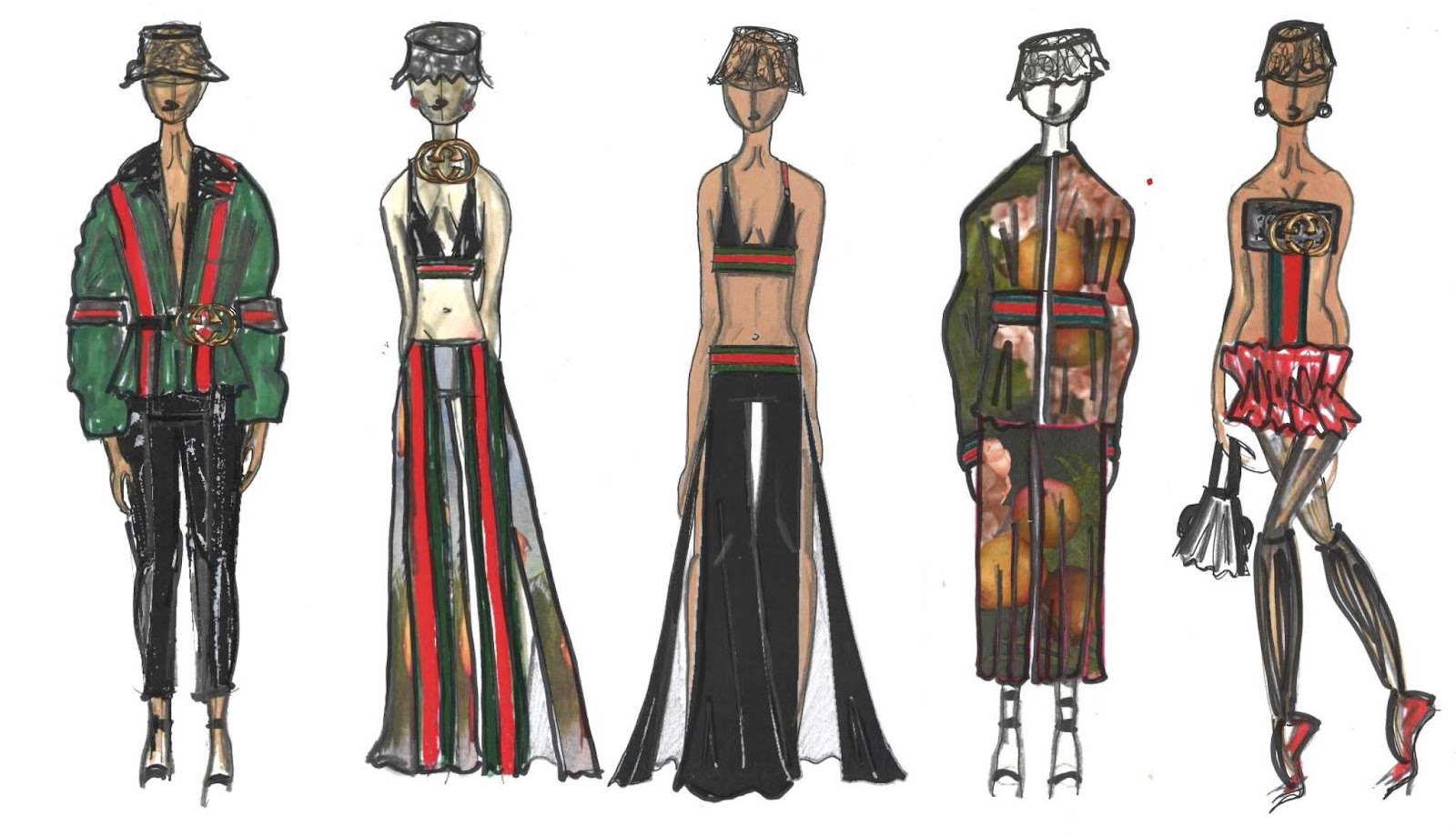
I elected 'Gucci' as my first choice, from a list of 9 labels, to work collaboratively towards elevating in new and considered direction. This was because I feel that many of the qualities 'Gucci' is synonymous with are being lost under the current, albeit innovative and exceptional, creative direction of Alessandro Michele. I knew I wanted to inject my own aesthetic into the brand whilst maintaining a sound and considerate understanding of Gucci past and present.

I threw myself right into the deep end and wanted a concept to develop on within the first hour of working. I was conscious to ensure group collaboration and to encourage a sharing of ideas. We all agreed that Gucci has always been a 'sexy 'luxury' brand and that a reintroduction of an aesthetic closer to that of Tom Ford's late 90's/ early 00's work, would benefit the brand. Very little passion and inspiration was voiced from my group peers, so I carefully assumed the role of leader within the group and pitched the following concept.

I wanted to create an eclectic 'Gucci' whose references are rich but whose silhouettes are more classic and 'feminine' in the more traditional sense of the word. 'Sex' was to be the primary driver for design whilst the 1970's 'good taste meets bad taste' look that dominates current collections should be carried through in some respects.

I looked to 1970's porn sets, where 'ugly' upholstery, seedy leather sofas and polyester curtains work within my current mood for the project. One image of a male porn-star in 'bad' denim trousers with a button- fastening all the way from the hem to the hip was particularly inspiring and became my first solid reference material.

I knew the print and textile designers in my team were working towards a floral print but was conscious of quite how much their initial work was grounded in a style very much the same as current Gucci. I felt the work would not move the brand forward and simply replicate what is already happening. I therefore encouraged my peers to look at Dutch and Flemish still life painting, namely that of Vermeer and Huysum, which I felt mirrored some of the upholstery I was looking at, yet would add a mature-feeling, luxury undertone to the more 'fun' and bad-taste references I was working on. I was extremely happy with all their work thenceforth thats maturity and elegance would ground my designs in a commercial and saleable realm.

I sketched with my peers' prints in mind and found a 00's silhouette was coming through naturally. I chose then to research further into the era. An haute-glam meets hip-hop character arose in my imagination- I felt the flesh-bearing, sex appeal of silhouettes inspired by this character would produce a well-needed break from the sexless, shapeless and casual garments that have been popular on the runway in recent seasons.

I could not avoid the over-branding of Gucci that happened in this era and how some of the merchandising associated with the label had become tacky or non-luxury seeming. I wanted therefore to take back ownership of the Gucci-stripe and give it a new lease of life, in very obvious way. I accented my initial collection ideas with the red and green stripe and believe it adds a fun, youthful touch, to some of the feminine looks I was working on.

For my final line up, I chose to focus on the low waisted hip-hop trouser of the 00's, the 70's pornstar trouser from my intial research as well as the Huysum/ Vermeer paintings which were informing the prints for the collection too.
Author's own


Three Words Project: Final Outcome

My final line up takes a feminine and light approach to my original inspiration. I have lifted specific tones and colour combination ideas from Bacon's work and have mixed this with the idea of his own studio palette. Thickly applied paint in many shades, as if worked over time, present the notion of history and narrative- that the piece has been stood, for Bacon to brush waste paint off on to, for years. Large, hand meets tentacle details are highly decorative and make for a surreal distortion of the human silhouette.  
Final Line Up- Author's own

When paired with simple, attentively-cut, tailored trousers, the overall look, although elaborate, feels wearable and glamourous whilst hand sewn bugle and seed beads add a touch of necessary luxury. 


Final Outcome- Author's own

Three Words Project: Design Development

Moving on from my initial ideas on octopus tentacles (derived from surreal imagery in my own dreams) I began to look at limbs and hands and how they might, in a dream like scenario morph into tentacles.

I am pleased with my experimentation with paint on my own hands and well this looks photographed then collaged.

I set myself the target to create more physical, textural samples and am happy with the 8 painted textile samples I have created both as colour studies in their own right and ideas for final product fabrications.

I have continued sketching in a prolific way and find sticking to the same colour palette a sure way to procure consistency throughout my project.

As my design process draws to a close I am refining my abundant research and design development material into a succinct collection that capitalises upon my original ideas of surrealist dream imagery (tentacles), Bacon texture and colour, and elaborate hand inspired decoration.

Design Development- Author's own


Sunday, 11 December 2016

Three Words Project

I believe this project gives much scope for extensive exploration. The combining of not necessarily connected words can provide interesting outcomes.

I have chosen to research and explore the great existential, abstract artist Francis Bacon. I love his use of colour (this was my primary reasoning for choosing his name from a list of iconic people such as Frank Zappa and Frank Lloyd Wright ).

Initially I felt the best way to research the artist was to gain a wider understanding of his work and the work of his contemporaries. This led me to research into Dali's self cannibalising creatures and the exploration of hell by the Chapman Brothers. I was prompted to note that it is ok to focus and specialise on one specific person, even more so one specific detail to do with that person. With this in mind, though happy to have developed my knowledge of surrealist and grotesque artists, I began to hone in on my favourite things about Bacon's art. I am pleased to conclude that my research is more focused because of this.

The primary concept of my explorations so far has been to take the dark, often morbid paintings of Bacon, that feature screaming and crucifixion, and translate the forms and figures within each work into patterns, florals and silhouettes much more light, feminine and 'beautiful' than the originals. I believe the outcomes so far are very succesful, most notably because of the strong and aesthetically harmonious colour palettes I have identified and curated from tones used by Bacon.

Sketchbook concept board author's own- using imagery from multiple sources


I have continued to explore the process of Frankenstein collages- I believe the ones I have produced for this project are the strongest yet because of their unique visual appeal and abstract quality.

I have explored fabric manipulation on the neck to make subtle reference to Bacon's personal struggle with chronic asthma. I wanted the result, much like the imagery on some of his portraits, to look like tumors/ disease/ infection.

I have been mindful of the lack of textile exploration on previous projects. For this final term sketchbook I am exploring painted textile and the creation of 3D, appliquéd florals to emanate the visuals of Bacon's work.

I do not wish to lift directly from Bacon's art, rather understand his style; his textured application of paint, existential musings and inner darkness. I aim to subvert this with ostensibly serene floral patterns, that on closer examination are formed from darker, original forms inspired by Bacon's art. Flashes of dark pink, red and black aim to hint at flesh, blood and death whilst surroundings of orange, green and lighter pinks will present indications of the opposite.

As regards to my second two words, the first being 'Francis Bacon' I am drawn towards 'Decorate' and 'Surreal'.

Surrealism is perhaps an obvious choice when exploring Bacon, though I feel strongly that my own angle on 'surrealism', namely the images that appear in my dreams like octopuses, teeth falling out and falling, can result in a unique outcome. I will use such images to create similar florals to those which I am designing with Bacon's painted silhouettes.

The research and outcomes so far are visually pleasing yet suspicious upon extensive inspection. The florals and silhouettes I am exploring are highly decorative. My final word then shall be 'decorate'.

Author's own


I believe my work so far is promising and I am excited to work on sampling, leading towards a hopefully succesful final garment.  

Wednesday, 7 December 2016

Saatchi Gallery and Tate Modern Visit 06/12/2016

'Deceive'

I have been greatly inspired by Richard Wilson's '20:50' Installation in the Saatchi Gallery. Wilson explores the art of deception masterfully. I could explore this notion in my own work too somehow perhaps via abstraction, distortion of silhouette or choice of materials, with which I could 'deceive' my audience in the very same way creating surprising and interactive clothing. I would work with reflection, sculpture and negative space to do this. The medium of sump oil could inform my colour choices or material choices also.

Richard Wilson's 20:50'
at the Saatchi Gallery, London

'Scratch'

I found the work of Raffi Kalendrian to be inspiring also. His colour combination and character exploration interests me. He works with 'real people' and creates a sense of 'story' within his oil paintings. His 'scratch work' (scratching layers of paint away to reveal the lower layer) could inspire the processes I choose to use within this project.

'Distort'

Ryan Mosley's oil paintings explored grotesque human figures in an interesting and endearing way. I liked the cultural feeling of the paintings as well as the profound sense of movement they conveyed. Print and pattern play a role in his art work and could inspire me in terms of the exploration of multiples and the distortion of the human body.

'Provoke'

To me, the work of Bjarne Melgaard was provocative and vibrant. His use of colour is impressive- I like his bold palette- whilst his exploration of slogans like 'cock' and written text could inform my own design work, where I too could use strategic words to provoke and captivate my audience/ client.

'Combine'

I loved the random quality of Richard Tuttle's 'System VI,  White Traffic' at the Tate Modern. His combination of wood, fireboard, terracotta, polystyrene and vinyl, among other mediums, was interesting and well-considered. I am inspired to combine, contrast and clash opposing and unrelated mediums within my final outcome.

'Peel'

Keith Sonnier's peeled layer of painted latex, manipulated with pigment and sawdust, on show at the Tate, inspires me to paint and peel in my own explorations. Using a liquid to then form a solid layer interests me and could result in the creation of an entirely new textile.

Sonnier's 'Red Flocked Wall'

Historical Details Project Fashion Shoot

I feel that my final shoot for this two-week project has been a success. I love the contrast of the bright
red against the cold stone back drop of the Queen's House and Royal Naval College in Greenwich. 

I would have liked to have shot inside the Queen's House but unfortunately was prevented by a typical jobsworth. The Queen's House holds many of the portraits I researched and referenced throughout the project so it would have been effective to photograph the final outcome against the original inspiration.

I am nevertheless very proud of the below shots.

Photographs Author's Own
Model: Olivia Morgan


Sunday, 4 December 2016

Historical Details Week Two

I wanted to choose a textured detail from my historical era to dissect and elevate into contemporary fashion. Using the skills learnt with Sarah in our design workshop, and developed during the two following projects, I started to sketch modern outfits inspired by details explored during my research. I picked three main details; a jacket fastening, a glove adornment and appliquéd stripes.

From the moment I saw the 17th century shoe (picture on previous blogpost) I was fascinated with the detailing and was determined to refer back to it later in the week. This striped detail soon became the key focus for my project. I love its linear effect and colour and am pleased that my designs inspired by it sufficiently elevate the detail.

My final line up works the detail as a top, skirt, jacket, coat and trousers. The mini-collection includes a fringing detail drawn from a woman's glove and bows inspired by a stomacher of the era.

Although the construction of a garment is not required for this project I felt too inspired to not create a piece and realise my ideas in 3D. I have worked on a jacket that references several design details from my research process. This includes tight pleating, an 'elevated-Puritan' collar (taking the typical Puritan style which dates directly before my chosen era and re-working it with an English restoration-style outlook), shoulder features and floral work as well as the focal appliquéd stripes.

I believe the final garment succesfully combines all my secondary and primary research. I could not have completed this project without my informative and deeply inspiring gallery, library, museum visits which gave me additional literary/visual inspiration beyond that easily available to and routinely used by other students.


Final Line Up