Wednesday 26 October 2016

FINAL WEEK 26-28.01.2016 Structural Attachment

In the last stages of this project I focused heavily on texture, using fabric and knit samples collaged with sketches to explore potential final outcomes. I love using yet again another method of design development and will use the style of design on future projects.

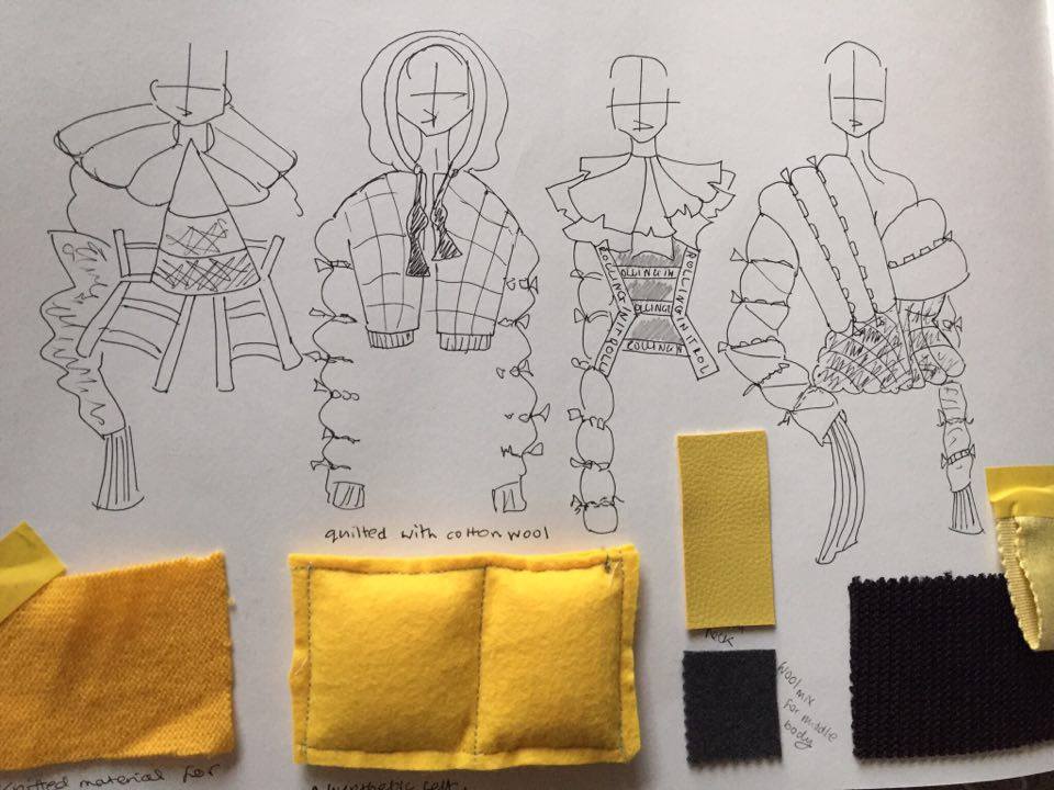
I have not strayed from my wish to use quilted pinstripe material in my final design. I trialled numerous variations of the style and looked at scale and silhouette. I cannot source any yellow pinstripe material and prefer the grey tones anyway. I am confident that my decision to use both grey and yellow is justified, albeit contrary to the brief.  I am happy though that 'monotone' was part of original criteria as I have ended up with a more focused, professional looking project because of it (hopefully the reasoning for having set it).

I explored appliquéing felt ladders onto the final jacket but intend instead to use my laser cut accessory because  I believe it will have the same effect without becoming a permanent feature. It also means that my actual garments are monotone, with the second colour remaining to only come with accessories.

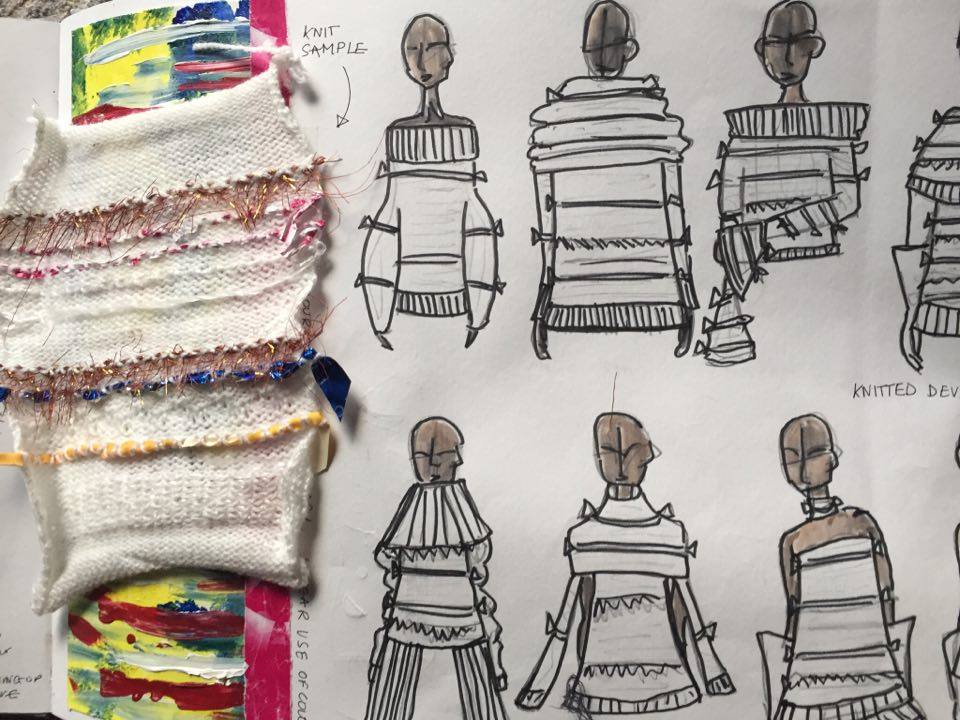
Having settled on a simple round neckline for my jacket, leaving the quilting as the main feature of the piece, all that remained was the development of my cuff/ glove accessories. I knew I wanted a subtle allusion to one of my original stimuli, the yellow rubber glove. My research into the structures of gender and the domestication of women/ their inferior position on the societal structure created by patriarchy, led me to develop yellow rubber glove throughout this project. In avoidance of a costume-like style, I neglected the use of actual rubber for my final piece in favour of more luxurious and wearable knitwear whilst also utilising knitting techniques I learnt earlier this month. The yellow cuff serves to contrast the heavily masculine pinstripe jacket. When finalising the design I decided that the combination of female and male could also be explored in the physical size of each glove/cuff- one being larger with the other feeling slimmer and more feminine. I decided that the gloves should feature 'ladder' imagery as reference to the social ladder- this will be in the form of actual knitted ladders as well as the addition of decorative cotton yarn to form the rungs of the ladder.

The decision to use both the laser-cut ladder accessory and the exaggerated length of the cuffs informed my decision to keep my trousers very simple. These will be cut in masculine wool material and have little specific detail besides the fact they shall be flared. The decision to flare the trousers has no theme-based reasoning behind it but has been made to be on-trend with the popularity of the style in current fashions.

Construction 
I have been constructing my designs in 3D since the age of seven therefore this process was not too difficult. I rarely use patterns and cut my final pieces from eye. I decided to use 6oz wadding for the quilting and satin-weave viscose for the lining. Having completed the construction of the jacket I hand sewed self-made binding on every raw edge and interior seam. I love the interior of the garment and am pleased with my decision to use binding as a finishing technique.

Knitting the cuffs was a lengthier process considering the first time I ever knitted was about three weeks ago. I am happy with the improvement I underwent when developing this new skill. I believe I have succesfully mastered the techniques of plain knitting, hemming, adding ladders and casting off.

Evaluation of construction 
In conclusion I feel I should have knitted my cuffs slightly wider for comfort and lined my trousers for extra quality and appeal. I would not use the satin viscose again because I found the satin lining snagged on occasion- I might use a plain weave on future projects instead. I am undecided how I feel about my decision to use 6oz wadding for the quilting. If I had used cotton wool (as an alternative for goose down) the rolls would have been more exaggerated (as I originally sketched) however I do like the beautiful wearability and relative stiffness of the wadding. Were I to develop an entire collection, I would use both styles.

Sketchbook author's own

Monday 24 October 2016

WEEK EIGHT 24-25.10.2016 Structural Attachment

The key concept of my final idea surrounds the contrast of archetypal masculine material with subtle reference to the domestication of the female as part of an overall exploration of gender and class structure. This requires however the use of both grey and yellow. I have made the decision to work with both the colours, with my main garments remaining monotone but my accessories incorporating the second colour.

I am greatly pleased with the pages I created with this in mind. I feel there are three definite stages to my portfolio where I take a step up each time. The look seems professional, cleaner and more concisely focused on specific developments. Deciding on the two colours helps the general look to feel more focused and I believe the combination works really well. I am pleased with my use of part printed part hand-done pages and will develop this method as I enter the final stage of design for this project.

My exploration of numerous variations of the quilted jacket confirms in my head that I want to use the technique for my final design.

At this stage I feel ready to start looking at existing fashion and photography to support my work, having previously avoided any active research into designers for fear of subliminal copying.

Peter Lindbergh's exploration of androgyny in his photography fits well with the aesthetic I have created. The idea of the contrast between the feminine form and masculine suiting is explored and works as part of a over arching theme looking at gender normalities and established structured mentalities regarding sex and gender.

A particular shot by Alessio Bolzoni's sees a model of ambiguous gender in pin striped suiting. Again this look works towards my overall design idea.

It would be remiss not to acknowledge also the highly prominent trend for quilting this season; I hasten to add however that I had decided to develop the technique before the release of the a/w 17 collections which saw quilting from Demna Gvasalia for Balenciaga and Vetements, Marques Almeida, Stella McCartney, Raf Simons and many more.

I do not feel directly influenced by existing practitioners work but am keen to continually analyse and explore current contemporary designers and artists and well as legends of art and design.

As I begin to wrap up my project I am looking at refining my final outcome. I am pleased with my decision to elevate certain looks away from a more costume-like aesthetic towards one with a high-end, luxurious appeal. This decision included avoiding the use of actual rubber for my exploration of the domestic rubber glove and instead using high quality mohair and cotton yarns to create a glove like cuff piece. The result is also more commercial without, I hope, compromising on creativity.


Cuff/glove development Sketchbook page author's own
Using imagery from 'Youtube' and Attitude magazine. 


WEEK SEVEN Structural Attachment Sketchbook 20-23.10.2016

Feeling that my research and initial design process was coming to a head I decided to note down the arising design ideas in a specific list.

Divided into two sections, the list was as follows

Gender Structure- Man above Woman                               The Class Structure- Upper, Middle, Lower

yellow rubber                                                                       quilting (rolling in it)
pinstripe tailoring                                                                 tailoring 
neck ties                                                                               bow ties
double breasted suits                                                            hoodies 
J-cloths                                                                                 dungarees 
embroidered D's                                                                   grabbed cash silhouette
gender symbols                                                                    fragile draping 
'apron' ruffling                                                                      triangle imagery
ladder climbing

I can safely conclude that barely one of these design ideas would have arisen without my research process. This proves my initial developments to have been succesful and stands me in good stead to develop a final piece as my project enters its final stages.

Looking back at all previous sketches and research I sketched five developed tops, eight jackets, ten pairs of trousers and eight coats all including relevant fabric samples. I felt very at home with this process as it feels most natural to me. I feel the designs created are succesful, if a little costume-like in style, and am most drawn the mixture of quilting and pinstripe tailoring.

I love the idea of taking the masculine material and developing it in a less common style, like with quilting or by adding vinyl as reference to the yellow rubber glove.

When sourcing material, I am now obliged to commit to one colour. Yellow has been a continual motif throughout the project and will definitely feature in my final design- this has derived almost solely from my exploration and development of the image of the domesticated woman and rubber washing up glove. A conflict however arises as I am determined to use grey pinstripe suiting in order to subvert the masculine archetype.

I love colour combination; I feel it is a crucial aspect of design- there is real art in getting it right. The combination of the varying shades of yellow with granite, aluminium and charcoal looks expensive and works so well for my design idea and response to the word 'Structure'. I will hold back on making any decision on my mono-tone as of yet but will proceed to use only grey and yellow from now on.

Sketchbook author's own

WEEK SEVEN Structural Attachment Sketchbook 17-19.10.2016

With quilting quickly becoming a fundamental focus of my project, I decided to produce some collaged sketches to play with scale as well as different types of quilting. The pages successfully develop the possible design technique. I was pleased with one particular collage as it demonstrated how several scales of quilting can be used in the same design- a giant shoulder contrasted with smaller checked quilting for example. My work on creating quilting samples gives an idea of how the technique will work in 3D.

My exploration of quilting is part of my 'rolling in it' idea that looks at the idea of the wealthy elite living with excess cash ('rolling' in money). I decided then to explore the other end of the scale using the same method of a slogan style title. For those lower on the social and gender structure i chose the literal slogan 'ladder climbing'. This looks at those 'lower' down as struggling social climbers attempting to tackle the daunting cliff like structure created by white patriarchy.

I loved the idea of introducing design details synonymous with the working classes as well as with women. These included the hoody, dungarees and 'feminine' details like the apron as previously in the sketchbook. The contrast between rich symbols (the 'rolling in it' quilting and masculine suiting material) and 'inferior' symbols like the hoody is effective and is a key concept for my project; one to be further developed.

Developing from last week, where I found that collage style design was leading me to discover more innovative silhouettes and styles I created a series of pages. I am pleased with the outcome as I believe the method has brought out more unique silhouettes than had I simply sat down to sketch with just fine-liner. My introduction of ladder imagery, in laser cut felt or machine embroidery, is part of my exploration of the 'social ladder' as a stimulus for design. I like the shapes created and will develop the idea of the ladder later in this project.

Sketchbook page Author's own
including imagery from 'The Economist'

Monday 17 October 2016

WEEK SIX Structural Attachment Sketchbook 10-16.10.2016

Materials, silhouettes and symbols related to and associated with both man and woman and each echelon of the class system have fuelled my work this week.

I am pleased with the pages as I believe they include a range of media (drawing, collage, photography, graphics etc) and capitalise upon what I believe is my strongest talent- design development sketching.

I am pleased that I have included my development of work completed on the knit workshop- I decided to use machine appliqué to give similar effects to my knitted design details, when working on woven materials.

Pinstripe tailoring (a 'masculine' material) and yellow rubber (alluding to the domestication of the female) remain core areas for exploration. I intend to develop these ideas later in the project.

I love my introduction of the hoody as a symbol for the lower classes especially when it is contrasted with the upper class-style bow tie as its toggles. The notion of direct contrast is becoming a motif in my exploration; pink apron frills with double breasted pinstripe tailoring or sportswear style elastication replacing satin trim on dress trousers are examples of this. These contrasts can and should be developed further.

I enjoyed using 3D collage as a basis for design and will use this technique again. Beginning with a cut paper piece or textured sample often informs the scale of the final outcome and can give interesting results such as in the case of using printed dollar piece where much larger shoulder pieces arose than had I just sketched as opposed to using the collage technique.

The dollar bill and money imagery aim to allude to excess wealth for those at the top of the societal structures we create. I intend to develop this imagery in print and silhouette later in the process.

Quilting has become a fundamental aspect of my project. I came to the decision to use quilting because it aims to be a direct translation of the phrase 'rolling in it' into fashion. The colloquial phrase suggests extraordinary wealth and to me the puffed rolls of quilting become the rippling rolls of wealth held by the lucky elite. When combined with sharp, folding, money-inspired silhouettes an interesting aesthetic is created- one that I wish to further explore.
Sketches and collages Author's own 

Sunday 16 October 2016

DAYS FOURTY, FOURTY ONE AND FOURTY FOUR Accessories Project 10/11/14.10.2016

I am greatly pleased with the result of this weeks accessories project. I have successfully developed a piece based on the elevation of everyday objects. My reference to the social ladder comes across strongly and I have made use of the university's prototyping room.

Working on a model scale before transitioning to full scale has proven to be an effective method of working for me although I do believe I could have developed more directly from the models for my final outcome as apposed to creating something new.

I enjoy photocopy manipulation; playing with scale when scanning my piece helped me to develop backgrounds for sketch book presentation and ideas on print design for one paper cage accessory.

I chose to work with two specific everyday objects, the spring from a washing peg and razor blades.

For me the two objects effectively contrast each other. One is symbolic of domestic housework and the other male tradition.  I like the idea that when climbing the social ladder, the white male makes it difficult for the climber; the sharp blades represent how difficult social mobility can be.

My ideas accumulated in a felt neck piece embellished with the two aforementioned objects.

I will be using the laser cutter again after discovering how succesful my design worked when cut in synthetic felt.

I like studio style photography but aim to conduct more location shoots as I progress through the course.

I think this week has been my favourite so far; it has confirmed quite how firmly my passion lies with design.


Photography Author's own

Wednesday 12 October 2016

DAY FORTY TWO Live Blog Post 12.10.2016

I have been stood fully immersed in one element of the 'Women and Work' exhibit curated by Valentina Ravaglia for the Tate Switch house. Work by Margaret Harrison, Kay Ham and Mary Kelly explores the lives and work of women workers in a Bermondsey steel factory. Ranging from portrait photography to typed daily itineraries, the collection is casual, reflective of the subjects' routine lives, almost boring and is so compelling because of it. I have picked up a phone captioned 'Medical Officer'. Listening to an unnamed, senior worker describe daily routines and problems is essentially uninspiring yet the focus on female prominence within a masculine environment makes her words important. The elderly female officer's voice and intonation is informally and unintentionally mesmeric. Her passion for what might be more often deemed as mundane makes me want to listen. Her description of thumb injuries and the employment of a steel cap for protection is vivid and a sense of character emerges. The women depicted are 'real' and diverse. It feels relevant with current debates on diversity in advertising and fashion and makes me contemplate the lack of representation for older women across the board in western society. I felt the collection was strong because of this.

Image lifted from
http://www.tate.org.uk/

Sunday 9 October 2016

DAYS TWENTY NINE/ THIRTY/ THRITY THREE Film Workshop 03/04/07.10.2016


I have mixed feelings about this week's fashion film promotion workshop. I do not feel I have significantly developed any skills as I feel I could have produced the standard of my end film already. We spent a great deal of time with little direction and discussing the inevitable and the obvious as opposed to developing creatively.
I did however receive positive feedback and constructive criticism from peers that would effectively inform any future film projects were I to conduct any. The positives of this week arose from peer analysis and self direction. I do not really identify with the 'set up/ pay off' school of film making we were exploring this week. I feel the sheer idea of deliberately trying to surprise an audience by subverting an archetype is clichéd and although undoubtedly effective commercially, leaves little room for extensive creative exploration. Nevertheless my idea was to explore two sides of a collection through one character- the set up being a depressed 'hot-mess' and the pay off being a brighter looking smiling girl. I had the idea to revolve the film around one specific change via the use of a cigarette turning into a flower. I agreed with criticism that stated the use of smoking and the flower had symbolic connotations with drug use and perhaps introduced an unintended counter message promoting drug use. I believe our song choice of Rhye's 'Open' and general aesthetic was successful and this was supported by feedback which included descriptions such as 'flowing with attitude' 'unified' and 'arty'. Most of our audience concluded that the film was too long and I agreed with this critique. I would focus on producing a more concise film on future projects. Most of our audience agreed that the change in mood was affective and that both sides of the video (each character) felt attractive in different ways. One group of peers' film seemed to meet the 'set up/ pay off' brief perfectly. It was a 'Converse All Star' ad, where all expectations led us to think glamorous clothing, make up and stilettos were being promoted but a final shot revealed the focus was on comfort and casual/ individual style via the wearing of the brand's trainers. Although the film was a success it felt clichéd and bland despite its 'surprising' qualities. I would certainly remember other peers' more ambiguous and 'art house' projects (ones that were criticised for having no pay off) over the Converse project. I enjoyed filming and styling the shoot and believe my editing skills were put to successful use. Despite some feelings of frustration, I believe were I to make another film it would be better. The session therefore has not been wasteful.


Screen shot stills of Author's own film photography. 


DAY TWENTY NINE 03.10.2016 Structural Attachment

I wanted to further explore my theme of the domestication of women within the social structure created by archaic patriarchy. I like the idea that we inherently associate or attach ourselves to one gender and are taught to behave in a certain way so as to adhere to expectations set by structural society.

The exploration undoubtedly is feminist but aims also to explore the implications of this structure on men and boys too. The pressure to fulfil certain stereotypes is often as strong for young men as it is for woman.

I used one of my favourite knitwear samples as the catalyst for a design development page and am really happy with the outcome. Focus lies namely on the yellow rubber glove symbol but also on the colours of blue and pink and what they both stand for in modern society, which is gender stereotyping and the early pigeonholing of children.

I loved working in this way; sketching multiple variations of a design idea works well for me and successfully develops the project.

Sketchbook and knit sample author's own

DAY TWENTY EIGHT 02.10.2016 Structural Attachment

With gender stereotypes and 'contrast' in mind I developed a short series of sketches. I love the looks created and will further explore the design aesthetic.

The collection's subversion of gender norms and combination of the symbols of different sexes is effective.

The main concept is to take traditional menswear i.e pinstripe suiting material, neck ties and tailoring and clash it with kitsch 'feminine' or rather domestic materials and symbols like the yellow rubber glove, frilly pink apron and garter strap. I love the idea of highlighting inherent social ideas on gender and sex. The looks aim to expose the negative side of social structure where man is placed above woman; where one sex is viewed as serious, professional and respectable and the other pretty, advantageous and servile.

I will develop the use of slogans like 'this suit makes me macho', 'housewife' and 'CEO'.

Sketchbook author's own

DAY TWENTY SEVEN 01.10.2016 Structural Attachment

I am pleased with my day's work setting out to present some of my knit samples from the preceding week's workshop.

My usage of J-Cloths, plastic bags and rubber washing gloves aimed to explore the domesticated image of the female. I am happy with the exploration; it has a physical/ tactile appeal as well as an emotional/ intellectual importance.

I would like to further explore stitching paper towels and J-Cloths together but am pleased enough with the sample displayed in my sketchbook.

I attempted sketching onto paper towels were but felt this was unsuccessful. The slightly blurred effect given by the absorbed ink looked good but the overall look felt fussy and irrelevant.

I feel my illustrative sketch of the traditional/ stereotypical domestic housewife could be bolder although I do like the overlapping, layered quality it has.

The use of blue works towards my exploration of gender stereotypes in that "blue is boy" and "pink is girl". I like the contrast between the domestic/ feminine imagery of my sketch and the heavy blue masculine tone.

Sketchbook and knit sample author's own