I believe this project gives much scope for extensive exploration. The combining of not necessarily connected words can provide interesting outcomes.
I have chosen to research and explore the great existential, abstract artist Francis Bacon. I love his use of colour (this was my primary reasoning for choosing his name from a list of iconic people such as Frank Zappa and Frank Lloyd Wright ).
Initially I felt the best way to research the artist was to gain a wider understanding of his work and the work of his contemporaries. This led me to research into Dali's self cannibalising creatures and the exploration of hell by the Chapman Brothers. I was prompted to note that it is ok to focus and specialise on one specific person, even more so one specific detail to do with that person. With this in mind, though happy to have developed my knowledge of surrealist and grotesque artists, I began to hone in on my favourite things about Bacon's art. I am pleased to conclude that my research is more focused because of this.
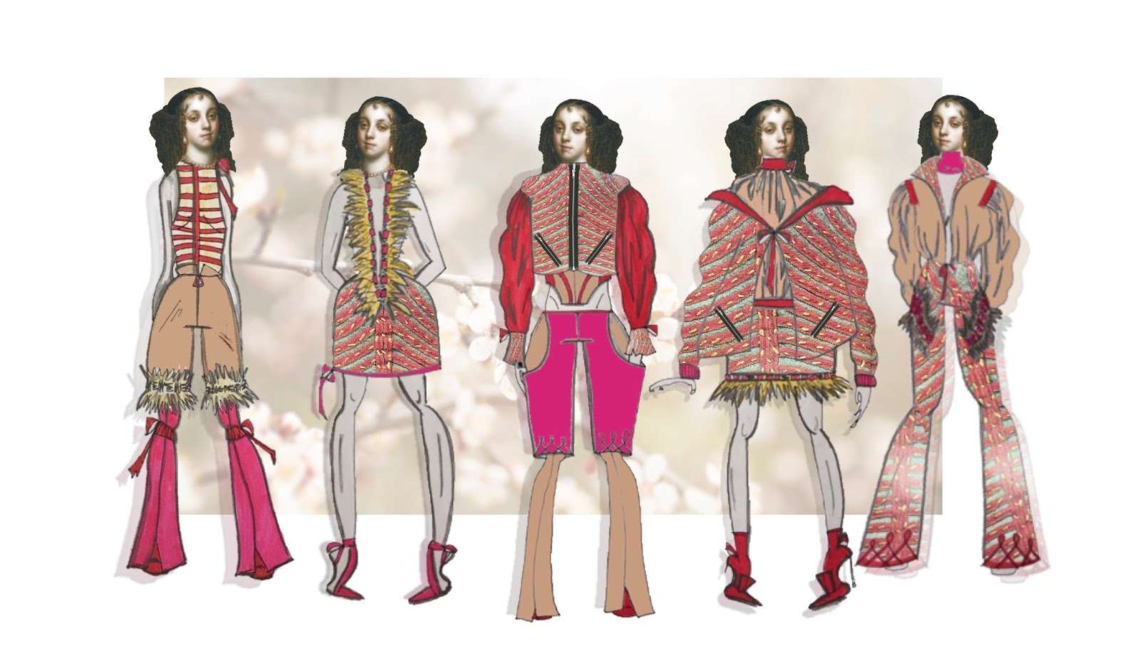
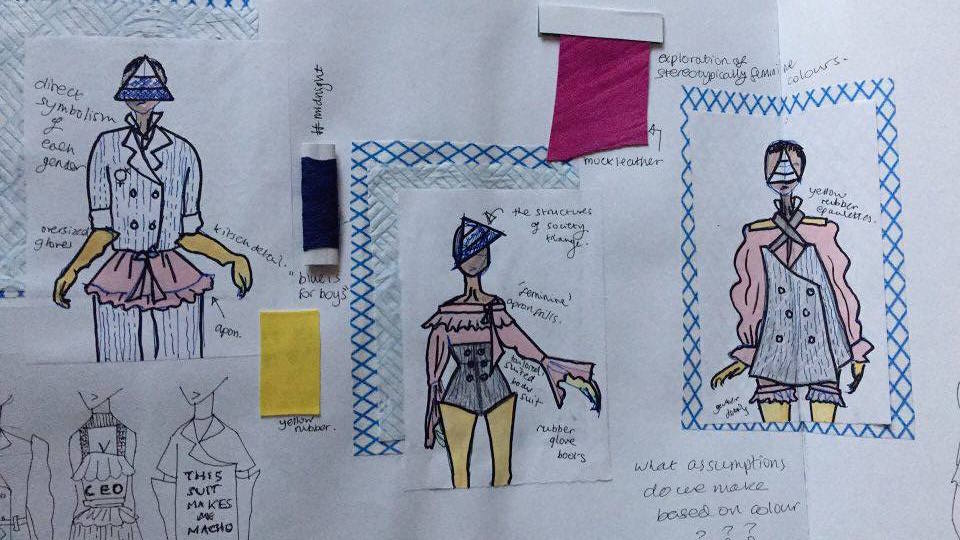
The primary concept of my explorations so far has been to take the dark, often morbid paintings of Bacon, that feature screaming and crucifixion, and translate the forms and figures within each work into patterns, florals and silhouettes much more light, feminine and 'beautiful' than the originals. I believe the outcomes so far are very succesful, most notably because of the strong and aesthetically harmonious colour palettes I have identified and curated from tones used by Bacon.
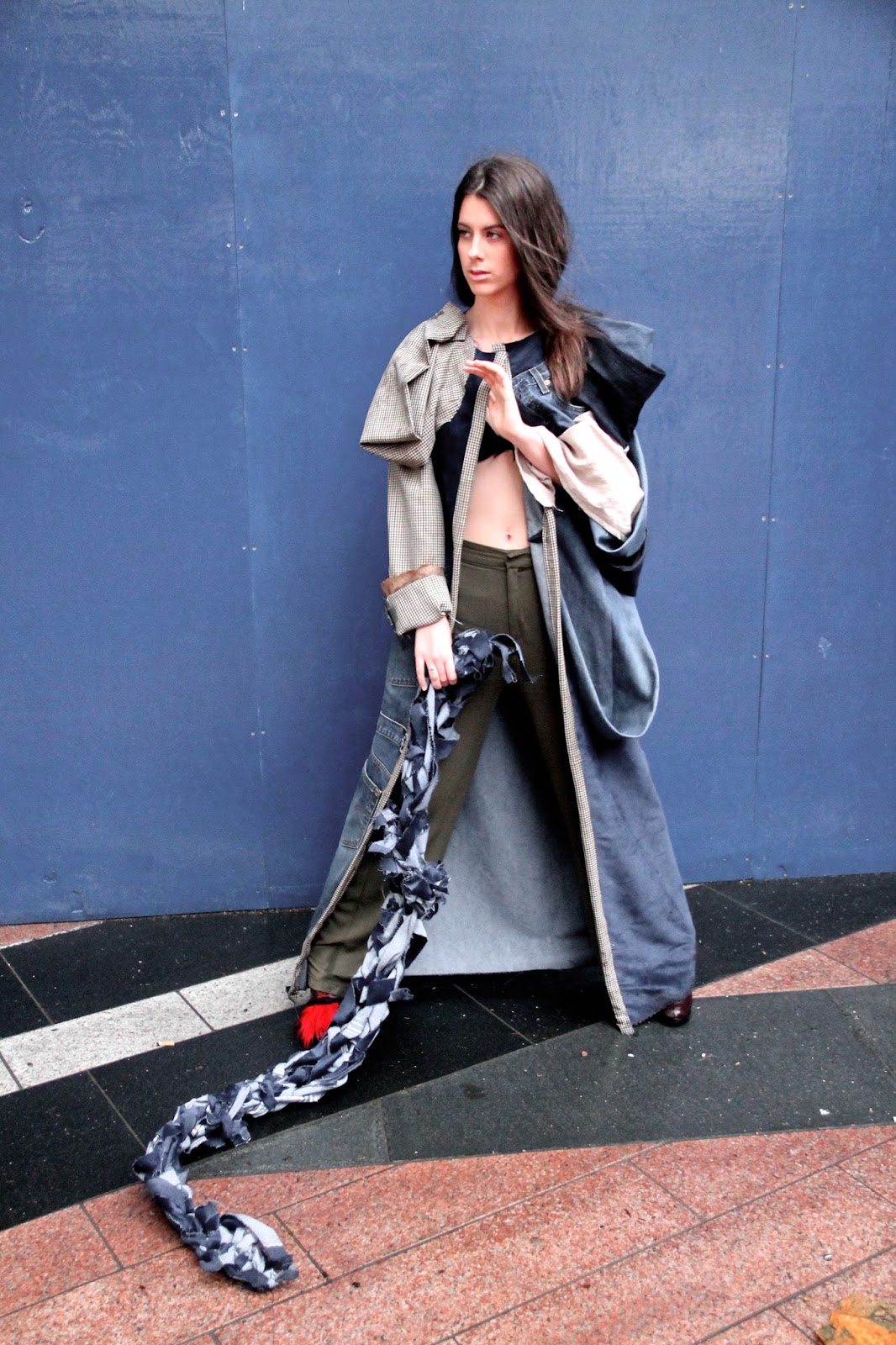
I have continued to explore the process of Frankenstein collages- I believe the ones I have produced for this project are the strongest yet because of their unique visual appeal and abstract quality.
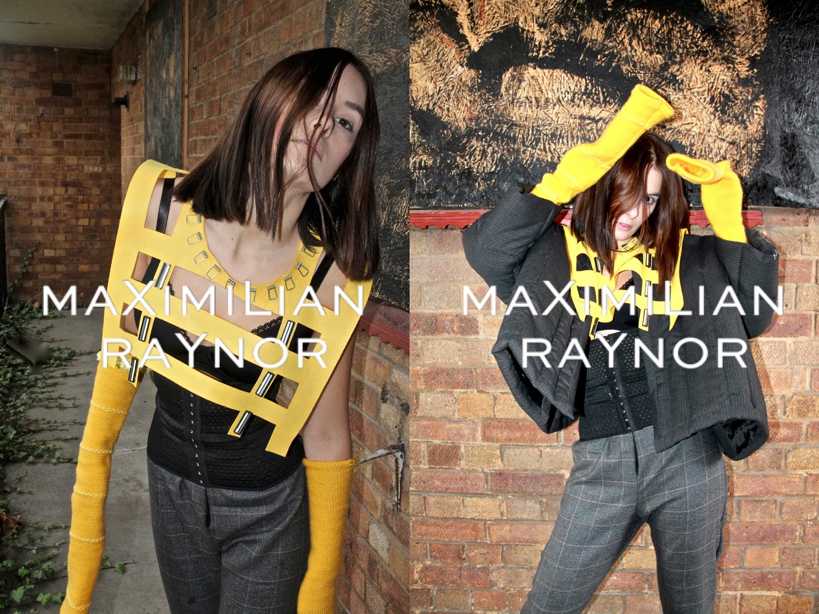
I have explored fabric manipulation on the neck to make subtle reference to Bacon's personal struggle with chronic asthma. I wanted the result, much like the imagery on some of his portraits, to look like tumors/ disease/ infection.
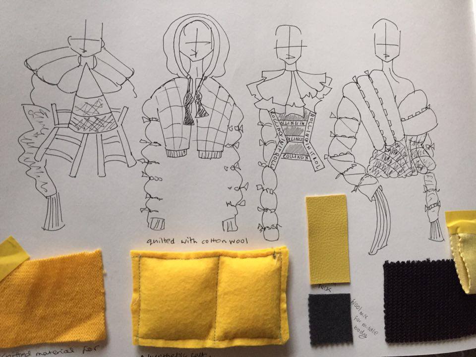
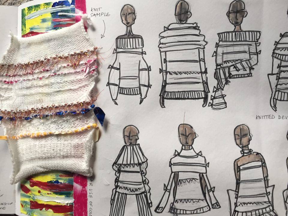
I have been mindful of the lack of textile exploration on previous projects. For this final term sketchbook I am exploring painted textile and the creation of 3D, appliquéd florals to emanate the visuals of Bacon's work.
I do not wish to lift directly from Bacon's art, rather understand his style; his textured application of paint, existential musings and inner darkness. I aim to subvert this with ostensibly serene floral patterns, that on closer examination are formed from darker, original forms inspired by Bacon's art. Flashes of dark pink, red and black aim to hint at flesh, blood and death whilst surroundings of orange, green and lighter pinks will present indications of the opposite.
As regards to my second two words, the first being 'Francis Bacon' I am drawn towards 'Decorate' and 'Surreal'.
Surrealism is perhaps an obvious choice when exploring Bacon, though I feel strongly that my own angle on 'surrealism', namely the images that appear in my dreams like octopuses, teeth falling out and falling, can result in a unique outcome. I will use such images to create similar florals to those which I am designing with Bacon's painted silhouettes.
The research and outcomes so far are visually pleasing yet suspicious upon extensive inspection. The florals and silhouettes I am exploring are highly decorative. My final word then shall be 'decorate'.
I believe my work so far is promising and I am excited to work on sampling, leading towards a hopefully succesful final garment.
I have chosen to research and explore the great existential, abstract artist Francis Bacon. I love his use of colour (this was my primary reasoning for choosing his name from a list of iconic people such as Frank Zappa and Frank Lloyd Wright ).
Initially I felt the best way to research the artist was to gain a wider understanding of his work and the work of his contemporaries. This led me to research into Dali's self cannibalising creatures and the exploration of hell by the Chapman Brothers. I was prompted to note that it is ok to focus and specialise on one specific person, even more so one specific detail to do with that person. With this in mind, though happy to have developed my knowledge of surrealist and grotesque artists, I began to hone in on my favourite things about Bacon's art. I am pleased to conclude that my research is more focused because of this.
The primary concept of my explorations so far has been to take the dark, often morbid paintings of Bacon, that feature screaming and crucifixion, and translate the forms and figures within each work into patterns, florals and silhouettes much more light, feminine and 'beautiful' than the originals. I believe the outcomes so far are very succesful, most notably because of the strong and aesthetically harmonious colour palettes I have identified and curated from tones used by Bacon.
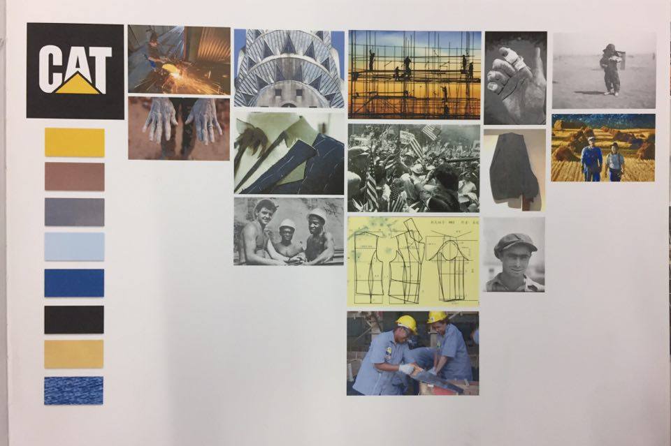
 |
| Sketchbook concept board author's own- using imagery from multiple sources |
I have continued to explore the process of Frankenstein collages- I believe the ones I have produced for this project are the strongest yet because of their unique visual appeal and abstract quality.
I have explored fabric manipulation on the neck to make subtle reference to Bacon's personal struggle with chronic asthma. I wanted the result, much like the imagery on some of his portraits, to look like tumors/ disease/ infection.
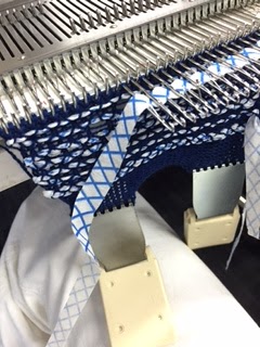
I have been mindful of the lack of textile exploration on previous projects. For this final term sketchbook I am exploring painted textile and the creation of 3D, appliquéd florals to emanate the visuals of Bacon's work.
I do not wish to lift directly from Bacon's art, rather understand his style; his textured application of paint, existential musings and inner darkness. I aim to subvert this with ostensibly serene floral patterns, that on closer examination are formed from darker, original forms inspired by Bacon's art. Flashes of dark pink, red and black aim to hint at flesh, blood and death whilst surroundings of orange, green and lighter pinks will present indications of the opposite.
As regards to my second two words, the first being 'Francis Bacon' I am drawn towards 'Decorate' and 'Surreal'.
Surrealism is perhaps an obvious choice when exploring Bacon, though I feel strongly that my own angle on 'surrealism', namely the images that appear in my dreams like octopuses, teeth falling out and falling, can result in a unique outcome. I will use such images to create similar florals to those which I am designing with Bacon's painted silhouettes.
The research and outcomes so far are visually pleasing yet suspicious upon extensive inspection. The florals and silhouettes I am exploring are highly decorative. My final word then shall be 'decorate'.
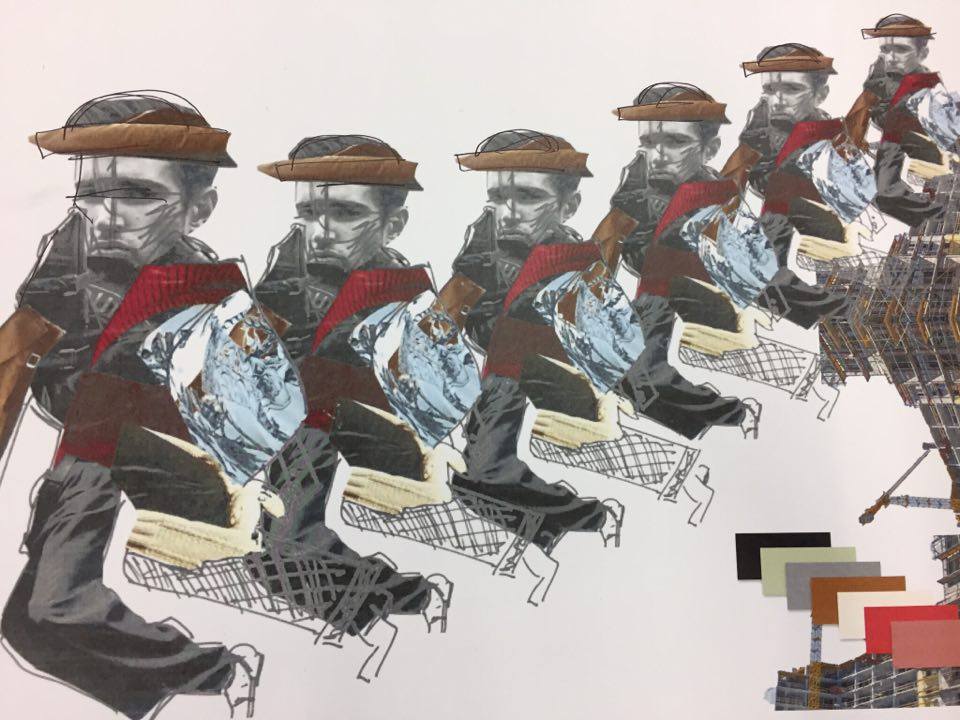
 |
| Author's own |
I believe my work so far is promising and I am excited to work on sampling, leading towards a hopefully succesful final garment.


